
Sand in My Camera Bag
Travel photography has shaped my approach to New England design, capturing details that influence every project I take on. Photography has guided my creative journey and approach to interiors from the very beginning. Sure, my studio art degree from Fairfield University hangs proudly on the wall (slightly askew, which feels fitting). But nothing compares to the lessons I’ve learned from just being outside.
This region is a photographer’s dream. From Nantucket to Vermont to Falmouth, there’s always something worth pointing a camera at. If you’ve ever traveled—or “weekended”—with me, you know I’m usually the one holding everyone up, stuck in photo mode. These aren’t just quick iPhone snaps—they’re references I keep coming back to for real inspiration.
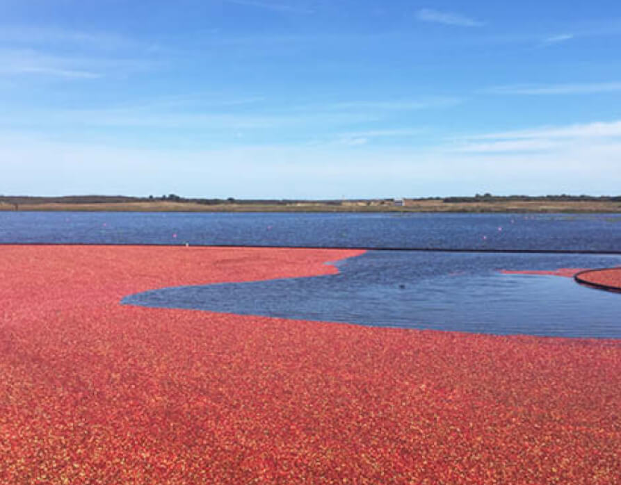

Nantucket Knows Red
If you haven’t been to Nantucket yet, here’s the plan: book the ferry, pack your preppiest sweater, and brace yourself for the prices (consider it part of the charm). The island is a study in contrasts: pristine white clapboard homes with glossy black shutters sit shoulder to shoulder with weathered fishing shacks that seem to lean into the sea breeze. You can wander downtown on foot and see it all—brick streets, flower-lined fences, and architecture that feels frozen in time.
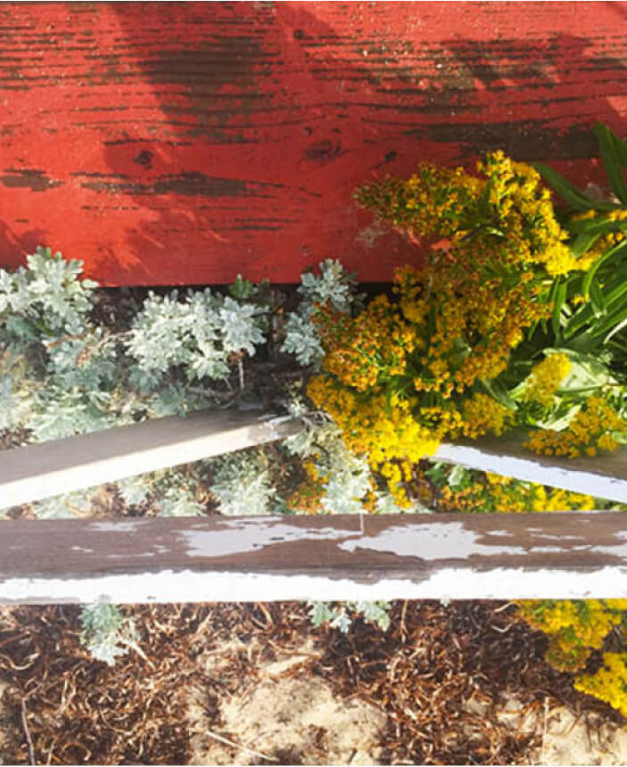
And then there’s “Nantucket Red.” It’s more than a soft pink—it’s a vibe. That iconic, sun-worn color perfectly captures the island’s balance of polished and imperfect. It’s a reminder that design doesn’t have to shout to stand out. Sometimes the beauty is in the details: a pair of shutters slightly askew, or a door that creaks just the right way when you open it.
I recently shared my thoughts on colors with history in The Boston Globe in an article featuring Pantone’s Color of the Year, Mocha Mousse. While not Nantucket Red, it shares a lived-in, timeworn quality. Dusty, faded shades feel historic, like once-bright jewel tones softened by sun and time. I love colors that look like they’ve spent a summer on the clothesline.


Green, Greener, Greenest
Sure, Vermont is famous for its après-ski winter charm, but summer is the real highlight. The greens are so vivid they feel fake, like someone got carried away with the saturation slider. The Equinox Resort is one of my go-to spots. Stunning views, a top-notch spa, leg-burning hiking trails, and excellent restaurants.
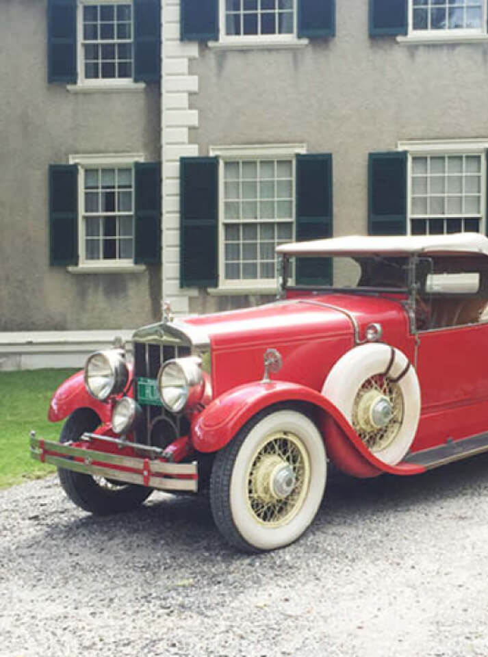
But Vermont isn’t just about the scenery—it’s the mashup of history and nature that gets me. There’s the stately Hildene Estate, charming covered bridges, and white clapboard homes nestled in fields. It’s that mix of rugged mountains and refined architecture that feels so quintessentially New England and inspires much of my work.
And then there’s the pace of life: slow. Like, really slow. I always leave with a clearer head, a fully loaded camera roll, and plenty of ideas to bring into my designs. Not just a getaway— a creative reset.
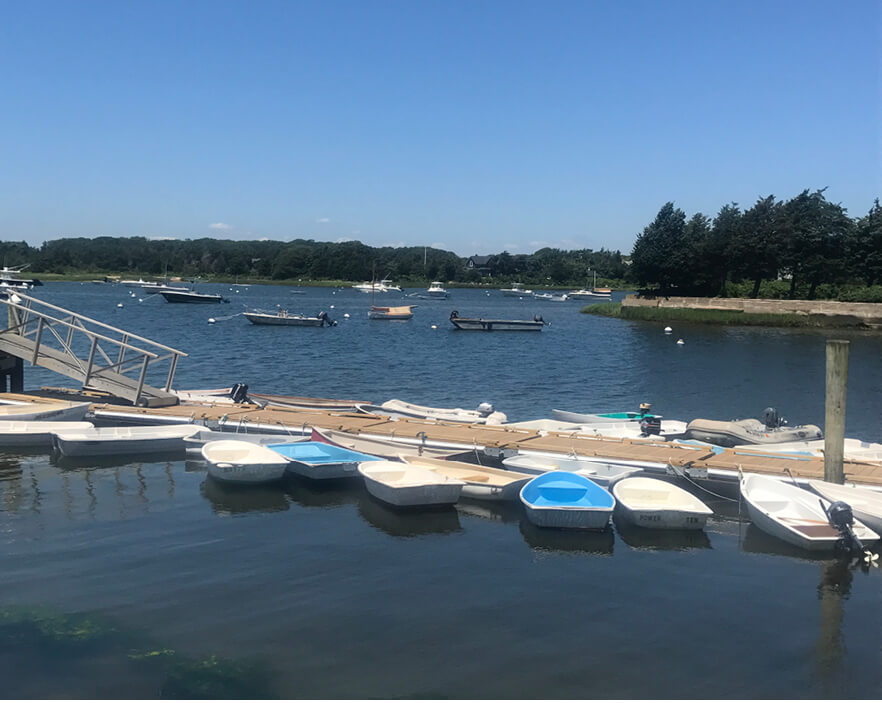
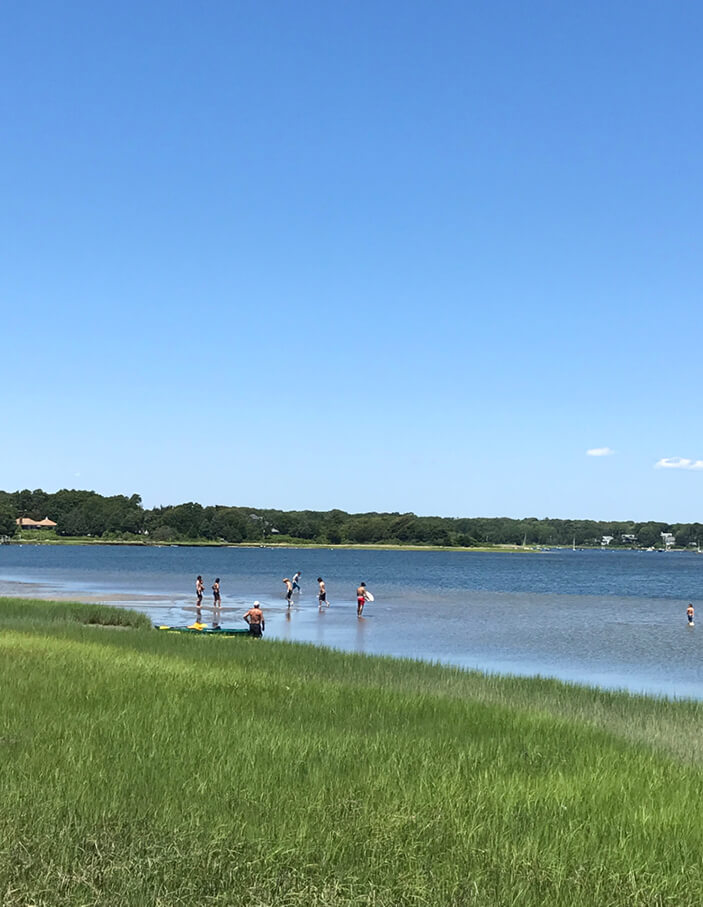
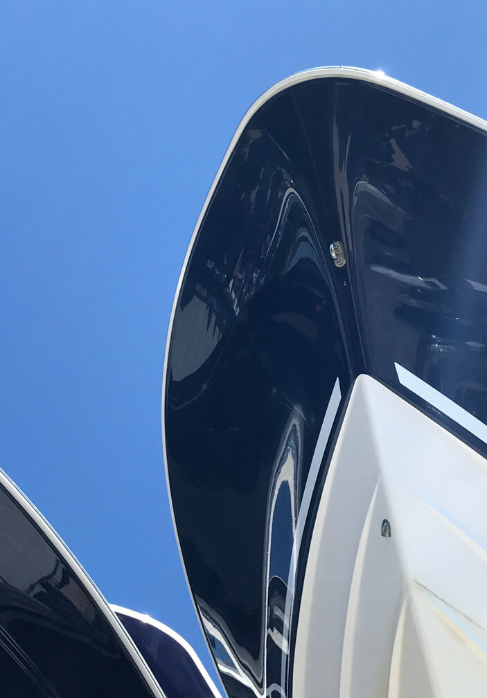
Small Boats, Big Inspiration
Cape Cod has shaped my life for as long as I can remember, and Falmouth never disappoints. It nails that effortless coastal vibe without feeling like a curated Instagram feed. It’s less than an hour from my door, which makes it dangerously easy to pop down for some nautical inspiration. Even the dinghies and smaller boats parked along the harbor have a kind of unintentional charm that makes you want to redesign a room in navy and white stripes—because, of course, that’s the unofficial uniform.
From the quirky Pied Piper boat to Edgartown to the harbor full of vessels that look straight out of a New England catalog. Falmouth is cute, without being over the top. It’s totally relatable and there’s always something to take home in the form of a color palette or a texture idea. Simple, classic, and easy—and that’s why I keep going back. You can’t take a bad photo on the water.
Through My (Slightly Sand-Dusted) Lens
More than a hobby—my photos are how I map out my design process. Each photo helps me capture details and textures that eventually find their way into my work – timeless northeast spaces. These photos aren’t just souvenirs—they’re quiet guides that continue to inform the way I see and shape New England design.


