NYC Interior Design Inspiration
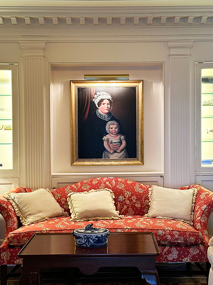
A quick trip from Boston to NYC—Amtrak Acela drops us right into the city. This time, we were on the Upper East Side for a day at our client’s Lenox Hill apartment: wallpaper went up, furniture arrived, the painter checked in. But before we get into the project details, we’re starting this post the way we started the day—walking the city and looking up.
From limestone facades on the Upper East Side to brick row houses in Greenwich Village, New York’s architecture never disappoints. Whether we’re sourcing for a client or just passing through, it always offers fresh perspective and unexpected design ideas.
Architecture on the Upper East Side
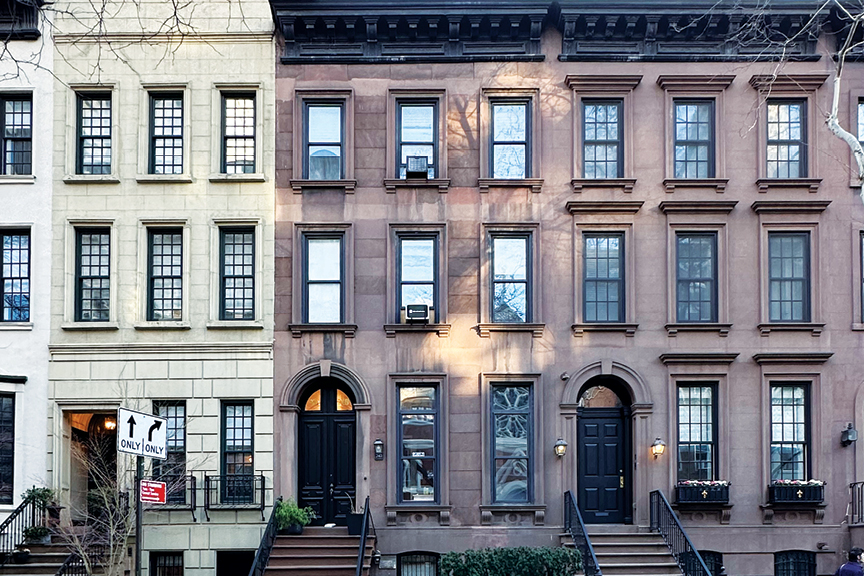
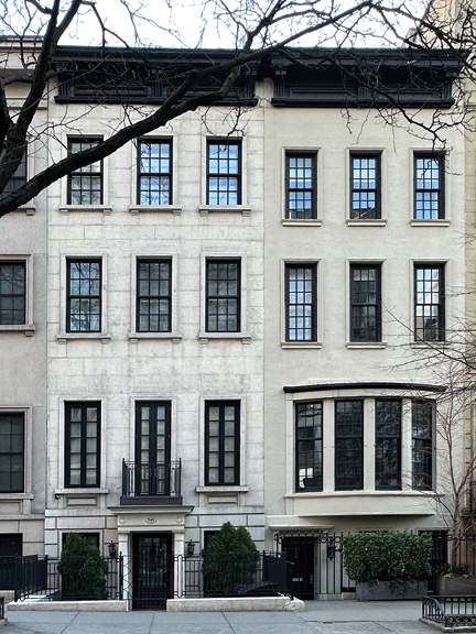
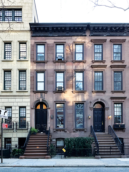
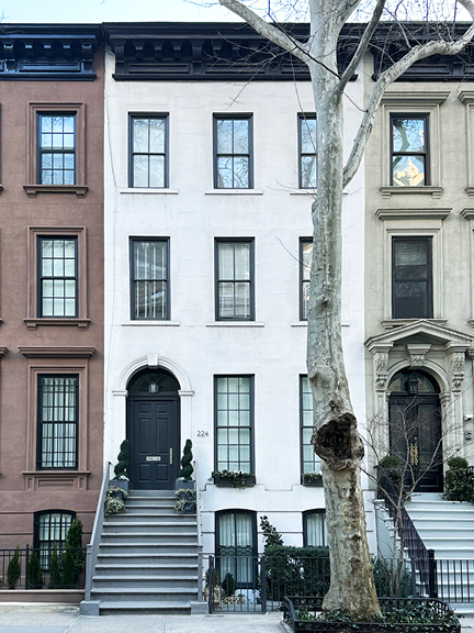
Brownstone architecture on the Upper East Side—especially around East 62nd Street—reflects the refined, restrained ‘look’ of late 19th-century New York rowhouse design. Unlike the more ornate ones in the West Village or Harlem, these brownstones feel uniform, formal, and intentional. I stopped for a series of photos: first, a pale stone façade in late sun; next, a rich reddish brownstone with a pristine entryway; and finally, a crisp light (almost white) version. Each had black-framed windows and black doors—a simple, striking detail repeated across elevations.
Greenwich Village
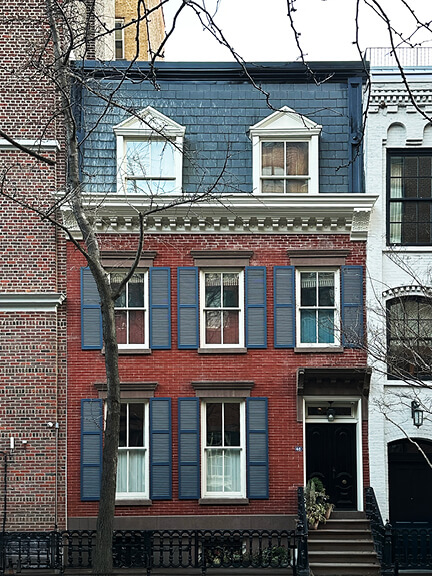
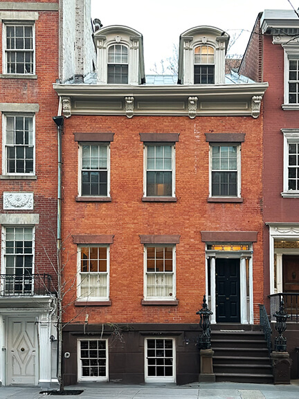
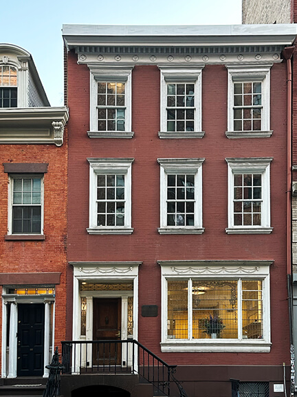
Brick row houses—low and refined, with Federal-style details like flat lintels, narrow windows, and simple entry surrounds. West 10th Street, between 5th & 6th Ave, line up with a quiet rhythm of symmetry and restraint. Built around the 1830s, the trio of beauties each offers its own variation. The first with a slate roof and matching blue shutters. Another with stately dormer windows capped in curved mansard roofs, and a third with a flat roof, and classic white-painted windows. The subtle carved reliefs above the lintels—decorative “swags” typical of early 19th-century design. They’re distinctly different from the taller, heavier brownstones back in Boston—less imposing, more human in scale.
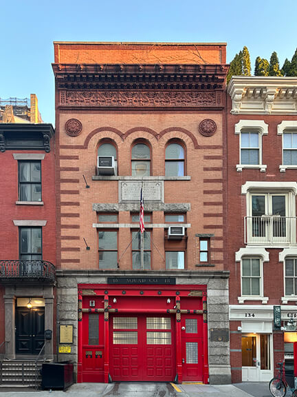
A few blocks over, Squad 18’s firehouse stands out with its Romanesque Revival arches and bold brick façade. Still in active use, it’s a reminder that utilitarian buildings can be some of the most enduring—and striking—on the street.
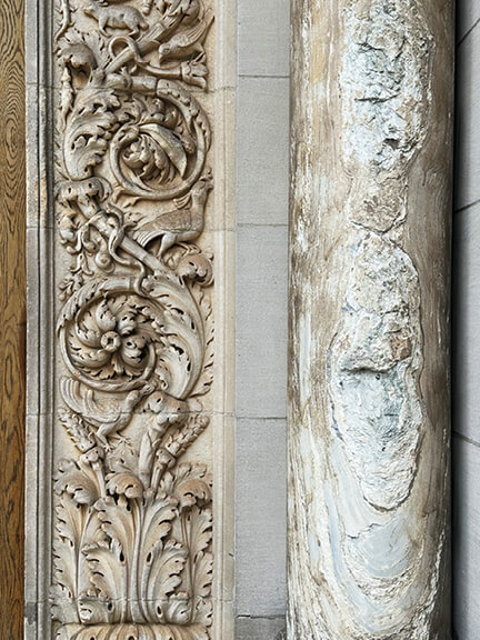
St. Bartholomew’s Church
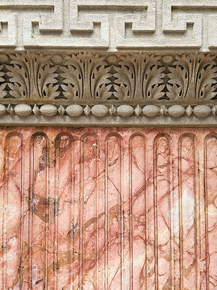
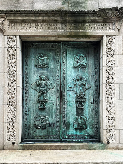
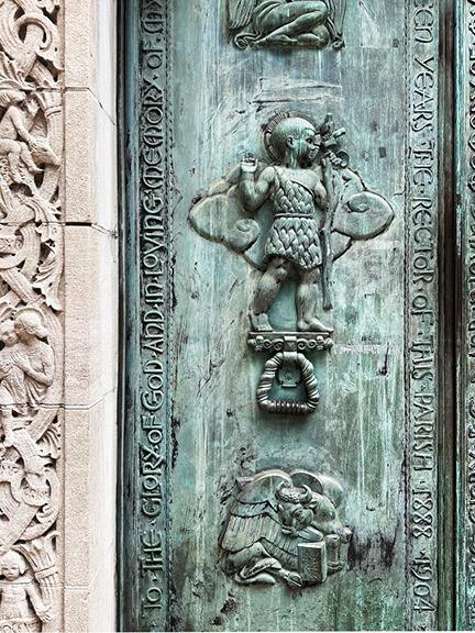
Three details from St. Bart’s caught my attention. Columns of pink marble, capped with carved stone, leads into a linear band of Greek fret—an unexpected and clean transition between materials. A nearby entry features a large bronze door, aged to green (like Lady Liberty). Surrounding it, the stonework is even more intricate—sharp, fine carving that feels at odds with the building’s heavy massing but makes the side entrance feel remarkably grand.
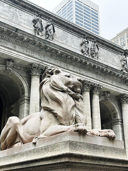
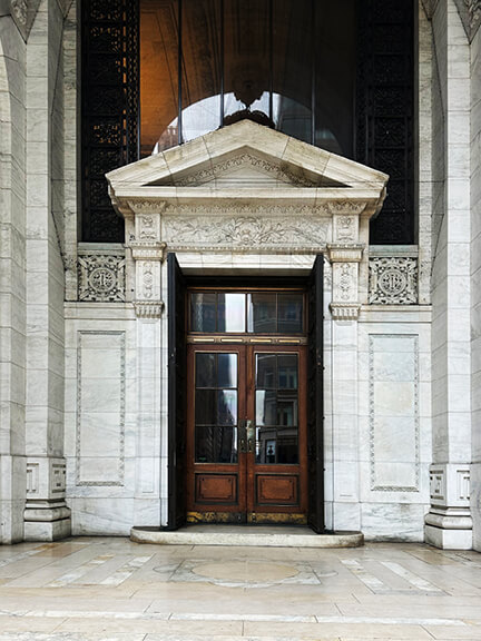
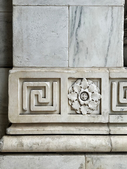
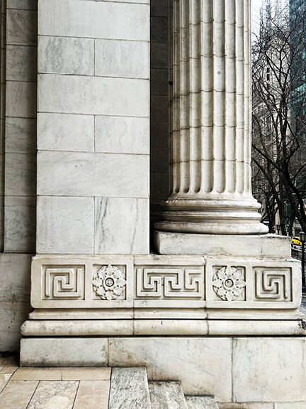
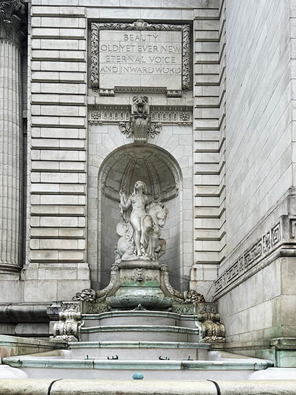
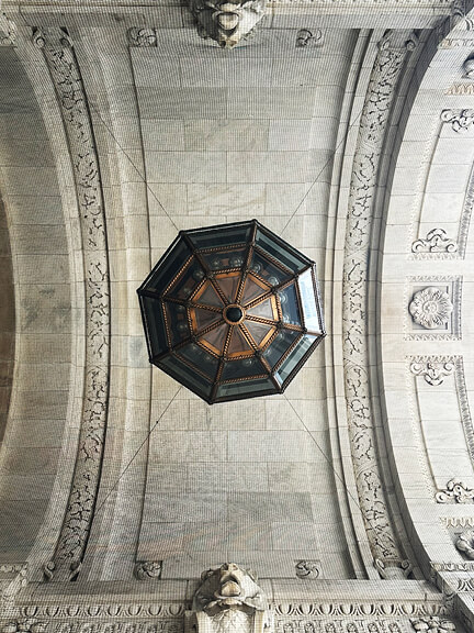
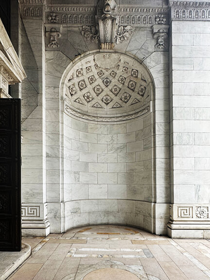
NYC Public Library
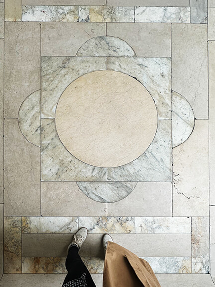
This will forever be the Ghostbusters library to me—child of the ’80s. I couldn’t make it inside (I had my suitcase in tow), but the exterior had more than enough to take in: carved marble lions, classical columns, and more Greek fret than expected. The patterned stone pavers and the detailing in the marble were my favorite parts—formal but still approachable, especially under the chaos of midtown and tourists.
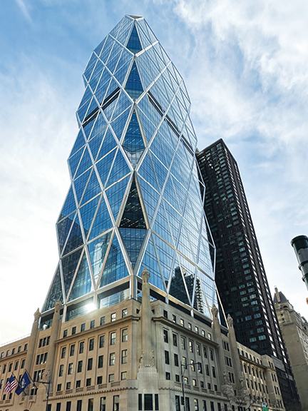
Angular Tower, Historic Base
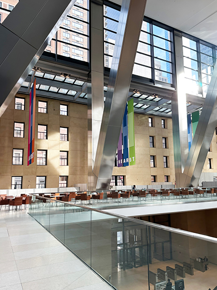
An impromptu catch-up with my Boston-based designer friend led me to Hearst Tower. Its angular glass form rises from a preserved 1928 Art Deco base. The contrast between historic architecture and sharp modern design always pulls me in, and the exterior stands out—NYC’s first LEED-certified building, completed in 2006. Inside, the preserved facade of the original building frames anatrium, and my friend Cecelia began her tour as we went up the tower. In the lobby/atrium, massive steel beams hold the tower above, allowing the orignal exterior stone walls to remain intact. Glass handrails and Knoll furniture add polish, and a dramatic water feature gives sculpted ice vibes… feels like every corporate lobby has a water feature.
The First Hearst
A unique and a meticulously preserved feature: a replica of the original executive office of William Randolph Hearst. Inside, some rooms mimic the 1928 interiors exactly. Traditional millwork, antique-style furniture, and vintage wall plates reappear in perfect detail. These spaces feel like a time capsule—warm, layered, and textural. Their charm offsets the modern exterior and the old-meets-new tension makes the space stand out. I was told the only real difference between these spaces and the original offices is the updated technology—every other detail is a true copy. Maybe not the most inspiring detail—unless you’re a fan of super traditional spaces—but I appreciated the gesture of maintaining the original spirit of the first Hearst offices. I like legacy.
Emerging Artists
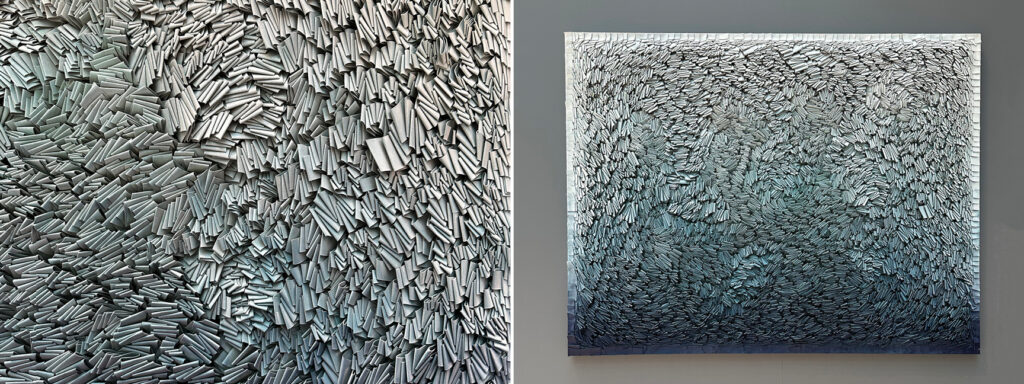
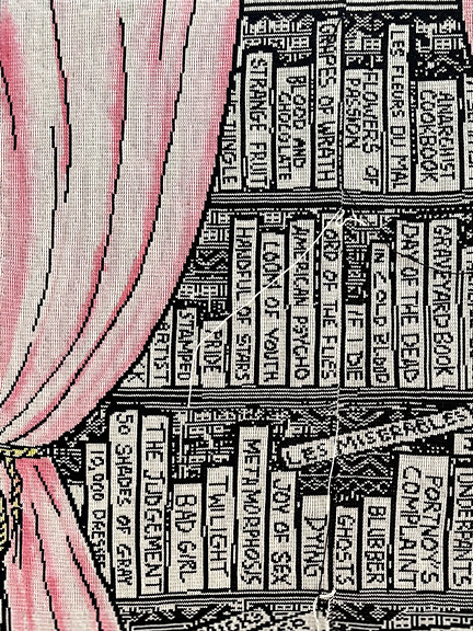
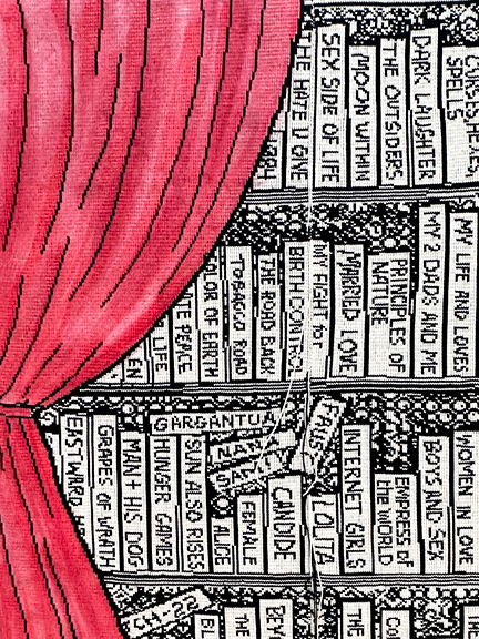
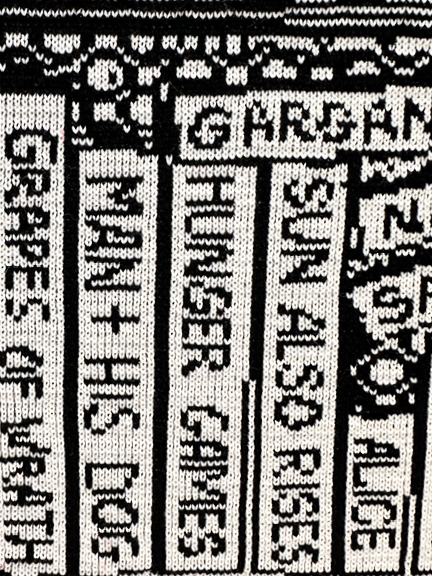
The building also houses a gallery that highlights emerging artists at its lobby and atrium, and my favorite happened to be the pieces that incorporated textiles. One piece featured folded material (latex) with a stunning ombré effect, building a tactile, organic rhythm (by Rodrigo Franzão). Another displayed knitted “curtains” revealing “bold messages beneath “illicit libraires” (knitted pieces by Lisa Anne Auerbach). Strong statements, strong craftsmanship. The shadow play, the lettering, the detail—it stayed with me (I’m a knitter). Emerging artists are a true source of NYC interior design inspiration—we’re always drawn to fresh perspectives from up-and-coming creatives.
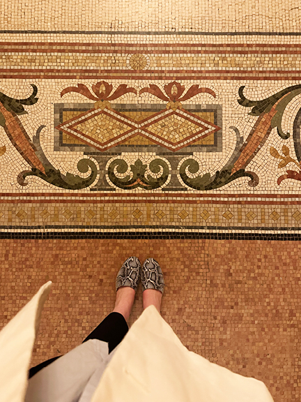
Landmark Mosaic Flooring
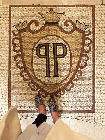
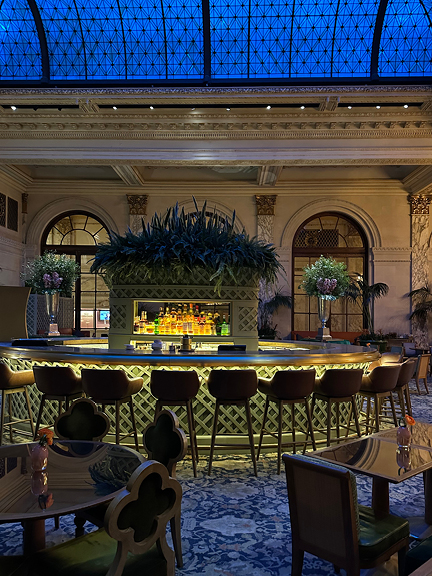
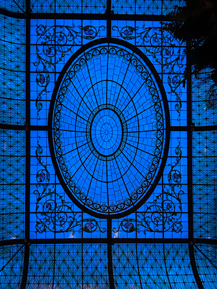
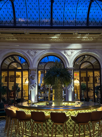
I walked through the Plaza Hotel as I made my way home, and since I have ‘this thing for floors’, I paused to appreciate the original mosaics. Designed by Henry Janeway Hardenbergh and expanded by Warren & Wetmore (thank you, Wikipedia), the flooring carries the hotel’s landmark history. Bronze accents and marble columns complete the story. The Palm Court, modeled after London’s Carlton Hotel, remains a standout. With its restored stained-glass ceiling, marble finishes, and palm trees, it delivers pure architectural clarity. No updates needed.

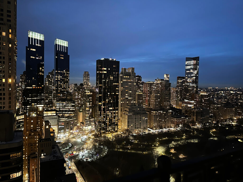
All About the Views
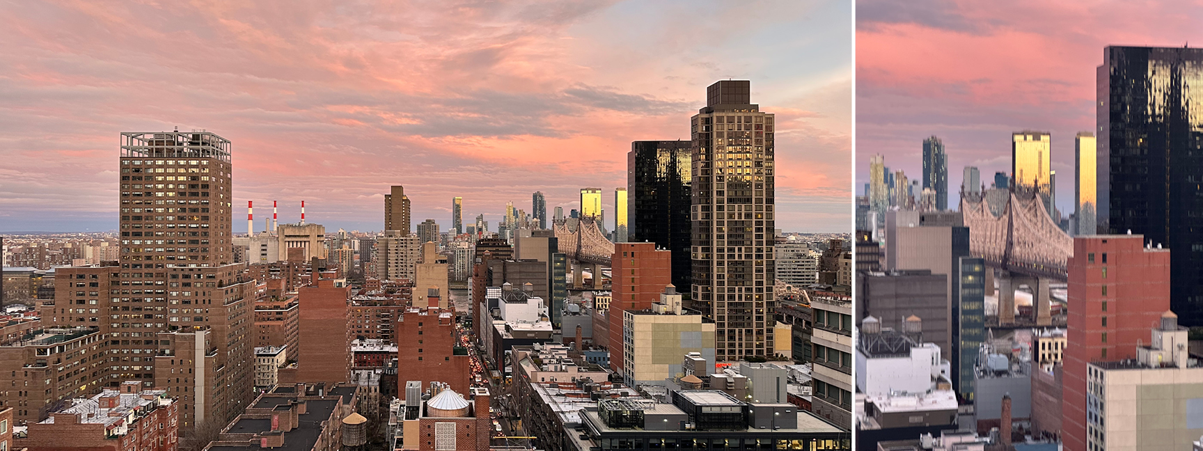
Before bed—and after sushi and wine—I got a quick tour of a penthouse under construction, designed by my friend Cecelia. The view speaks for itself, from the terrace, you could see straight to the edge of Central Park. It was all about the lights, and the energy of New York at night is pretty much unmatchable.
In The Details
Every time we’re in the city, there’s something new to absorb— layered architecture, inventive art, or just a perfect view at golden hour. This trip reminded me how much inspiration lives in the details: modern architecture, a hand-laid mosaic, knitted art in a gallery lobby. Even a quick work trip to a familiar city can spark new ideas. For more on how time in other places shapes our design approach, here’s a deeper look. We’ll end the post with my client’s balcony view: the Queensboro Bridge in the distance, the sunset did its part.