Los Angeles Shopping and Dining: Design-Driven Stops in WeHo
There’s no shortage of design in West Hollywood—Los Angeles shopping and dining at its finest. WeHo has some of the coolest restaurants, brunch spots, and coffee shops around. A short walk each morning had me wondering: do people here even work? Everyone looked like they’d just come from a workout class, perfectly styled in matching Alo Yoga. But I digress.
The real design moments—from materials to millwork—are covered in a separate post on the area’s many showrooms. Still, the Los Angeles shopping and dining scene deserves a mention. Every meal (or break from our design meetings) offered plenty of inspiration. Beyond strong Americanos and great cocktails, I was drawn to the hospitality design and retail environments—spoken like a true former commercial interior designer. And like most creatives, I’m always hunting for a new wardrobe piece. A few favorite restaurants and shops are included here.
Great White: Breakfast, Burritos, and Plaster Dreams
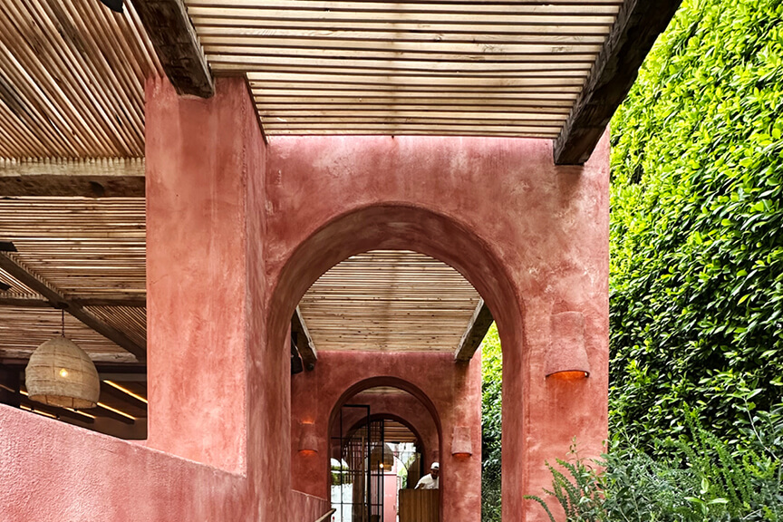
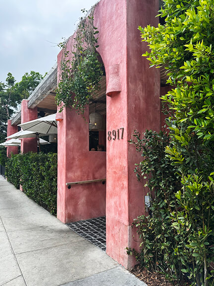
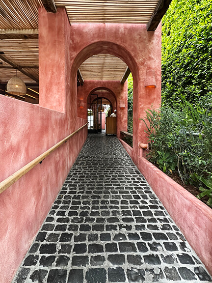
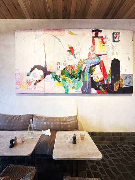
Great White is the one we kept going back to—and for good reason. My friend found her favorite dish, and I was more than happy to return for the breakfast burrito. And the environment is just as fabulous as the food. The restaurant’s pink plaster exterior stands out immediately, pulling you in from the street. A dark tumbled stone walkway leads to the entrance and continues through the interior and covered porch.
The plastered facade integrates lighting and greenery in a way that feels seamless. Wood details wrap the porch and disguise acrylic panels overhead—cleverly keeping rain out without sacrificing aesthetics. Graphic design is integrated in subtle ways, from the strawberry motifs on the menu to the playful shark sketches printed on the receipts.
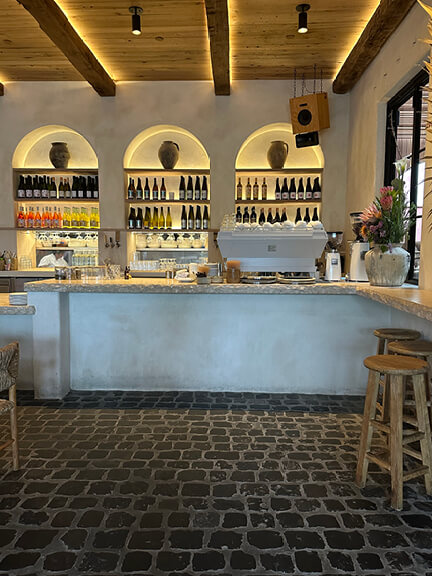
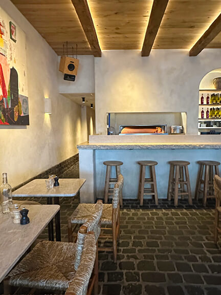
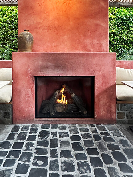
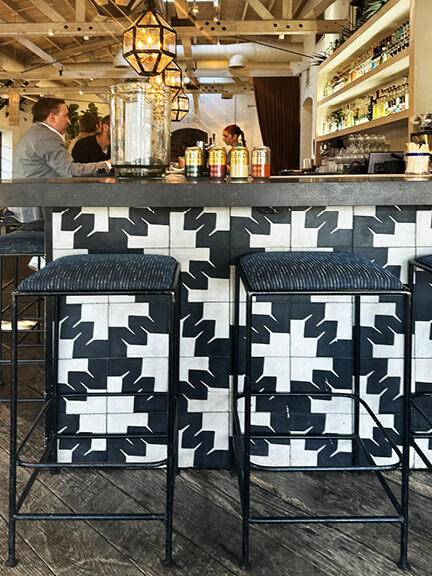
The space transitions effortlessly from day to night. The main bar serves wine and cocktails, but also anchors a giant espresso machine, putting forth the best café Americano (and chai lattes) in the neighborhood. Inside, most of the palette is off-white plaster and warm wood. One oversized abstract painting delivers a single hit of color (art by Danny Gretscher), while mixed furnishings round things out—cushioned banquettes, rush seats, and natural wood stools. The covered porch features multiple gas fireplaces—completely necessary, even in warm, sunny LA. And if you notice a lone light stone set in a sea of dark grey tiles—you’re not imagining it; just Great White’s version of a wink.


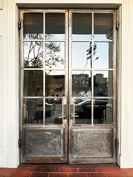
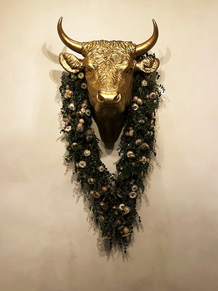
A.O.C. Brentwood: Vintage Layers and French Market Feels
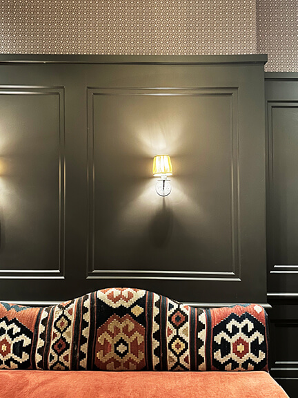
A design friend is obsessed with Nickey Kehoe (aren’t we all?), so we headed to Brentwood to see A.O.C.—one of their signature restaurant projects. The entry sets the tone immediately with heavy reclaimed metal doors, vintage furniture, and a sculptural cow’s head bust adorned with dried flowers. Inside, the space splits in two. On one side: a dark, moody bar with simple booth seating and low lighting. The lighting stopped me in my tracks—a farmhouse-style chandelier with red fabric shades, softly glowing against the room’s green palette.
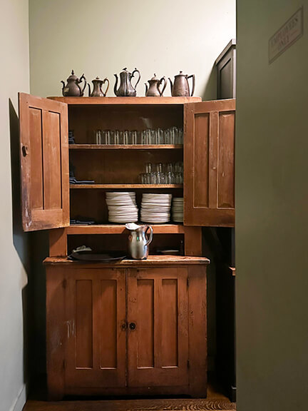
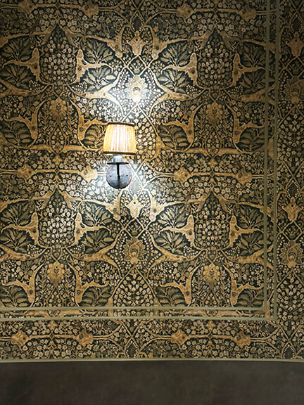
Throughout the space, vintage cupboards act as both décor and function. They serve the waitstaff, holding plates, clean glassware, and what looked like a collection of pewter (or silver?) pitchers. It felt like someone had just come back from a flea market in Provence. A separate dining room features Lewis & Wood wallpaper, paired with petite wall sconces that flicker rather than shine. A private room toward the back is wrapped in dark green millwork, patterned wallpaper, and a bold Native American–inspired upholstered bench. It’s a comforting space—layered, textural, and warm. A.O.C. feels like a historic New England dining room dropped into the middle of modern Los Angeles.
Deisgn aside… here’s what we ordered. Clementine Fizz for a cocktail; kampachi aguachile with pickled radish, urfa, and crème fraîche to start; striped bass with crab broth soubise, asparagus, and béarnaise paired with a glass of rosé; finished with butterscotch pôt de crème, crème fraîche, and salted cashew cookies.
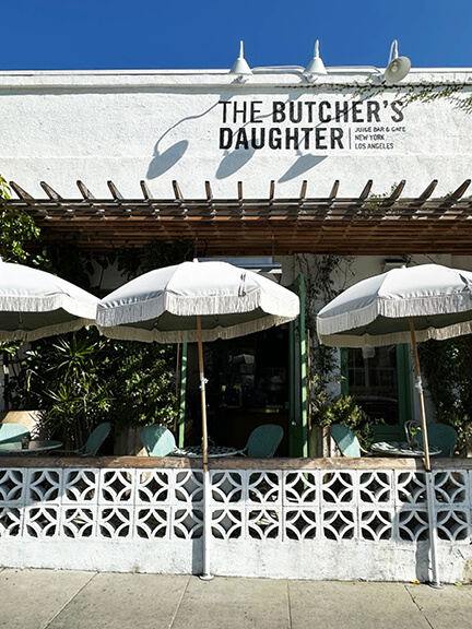
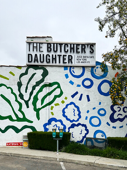
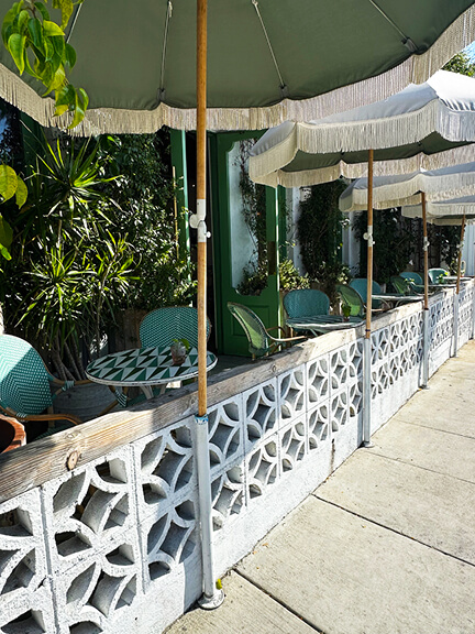
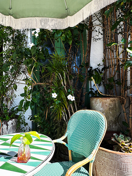
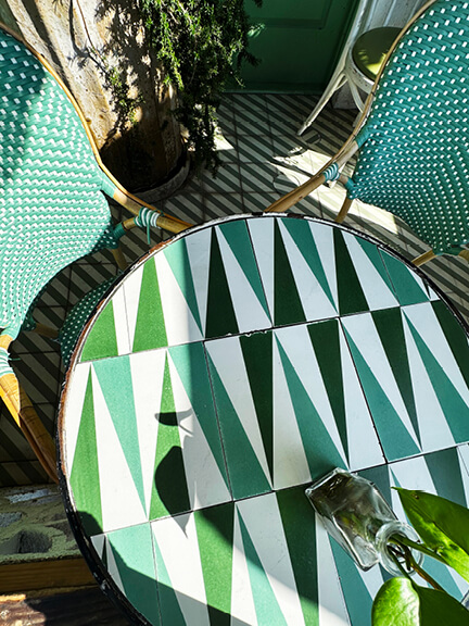
The Butcher’s Daughter: Fringe Umbrellas and Fresh Greens
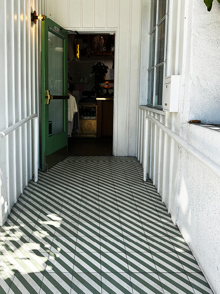
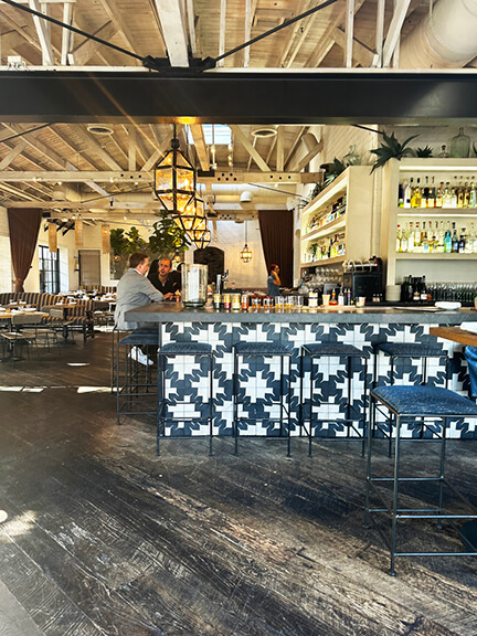
The Butcher’s Daughter grabs you from the street. An inspiring patio stretches across the front, with light green umbrellas trimmed in fringe and white-painted breeze blocks adding a crisp architectural edge. The diagonal concrete tile at the entrance carries the green theme, leading into a bright, layered space. Even the side entrance—off the parking lot—makes an impact with a large-scale mural that sets the tone: light, fun, and full of energy.
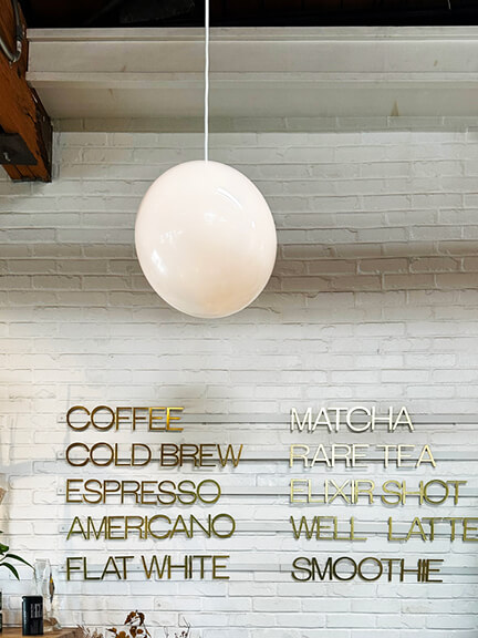
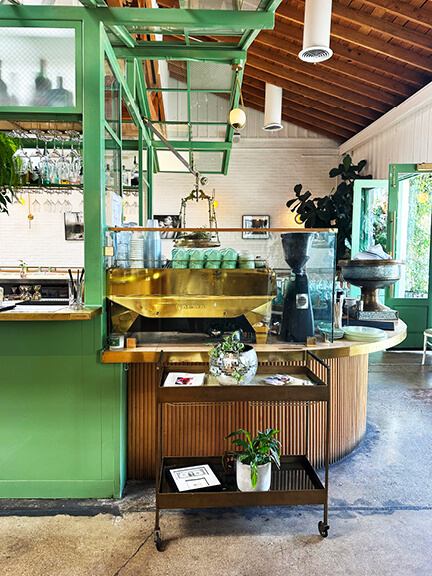
The patio continues the graphic play. Tabletops are patterned in white, green, and blue, paired with aqua-toned French bistro chairs. But it’s the fringe on the umbrellas that gets me—just cute. Step inside and you’re greeted by a compact coffee bar. White-painted brick walls feature brass lettering spelling out the menu. The central bar steals the show—painted a bold green and framed in what looks like a vintage greenhouse structure. It’s overflowing with greenery, layered with natural wood and brass trim.
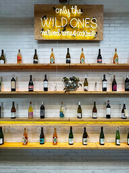
Toward the back, a shelving area displays wine offerings. Custom neon lighting and floating shelves finish it off with style. The whole place feels refreshing—designed, but never trying too hard. Just right for an afternoon stop on your shop and dine LA itinerary. Designer and founder Heather Tierney has a distinctive aesthetic all her own.
Brunch notes: Americano (cheaper here than in New England, thank you very much), crab cake sliders, and booze/juice. I opted for a wellness latte post-meal—Golden State, with turmeric, maple, pepper, and almond milk.
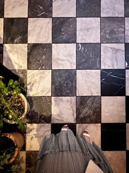
LAVO: Checkerboard Floors and Mediterranean Drama
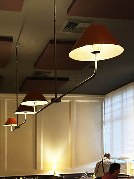
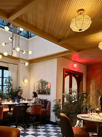
LAVO was delicious and gave all the Mediterraanean villa vibes, taking you from the Sunset Strip to southern Italy. The space opens with classic black-and-white checkerboard marble floors—a bold, timeless touch. The bar sits just off the entry and features arched wall openings with glass transoms above. These frame the view into the main dining room and create depth without closing off the space.
Plaster walls and a natural wood ceiling warm things up, softened further by sculptural modern lighting. Near the front, a smaller dining area sits beneath a dramatic double-height atrium. Oversized light fixtures hang from above, floating over the tables like suspended art. LAVO balances drama with ease, giving you a stylish dinner setting on your Los Angeles shopping and dining circuit.
I began with a Paloma cocktail, we shared crispy zucchini blossoms filled with lemon zest and ricotta. For the main course, tagliatelle Bolognese, paired perfectly with a glass of red wine; lemon olive oil cake to finish.
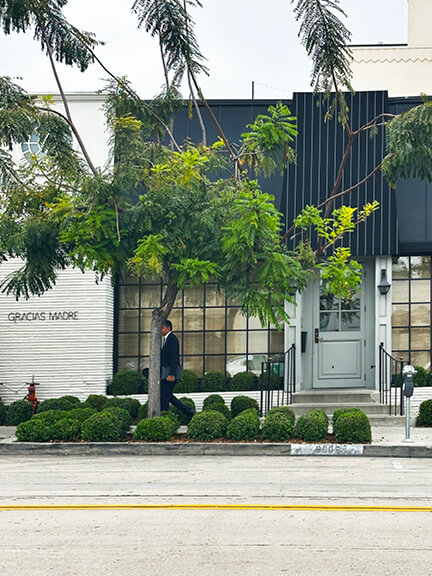
Gracias Madre: Plant-Based Dining with a Graphic Edge
I’m a former vegan (I couldn’t make it stick—I love Italian food, especially a proper Bolognese). But I’m always open to a fully plant-based experience, and the rumors about Gracias Madre were hard to ignore. People claimed you couldn’t even tell it was vegan—especially bold for a Mexican-inspired restaurant.
The exterior sets a strong tone. Traditional double doors meet a modern black-and-white palette—white-painted brick, matte black trim, and, of course, the best collection of plants in the city. Inside, the bar hits you right away with graphic concrete floor tiles in a bold black-and-white pattern. Simple metal chairs, dark upholstery, and an exposed ceiling—imperfectly painted white—set the mood. The lighting leans traditional, softening the otherwise contemporary layout.
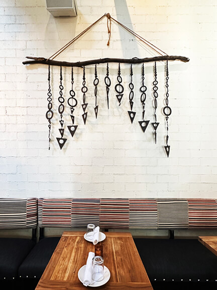
A smaller dining space off the main room features Zak + Fox upholstery and a sculptural art piece that looks like a wind chime—unexpected and fun. Outside, the restaurant nearly doubles in size with a sprawling patio. Another bar, more concrete tile, and tons of lounge seating—sofas, chairs, the works.
Vegan fare: chips and guac, spicey margarite (times two), taco salad.
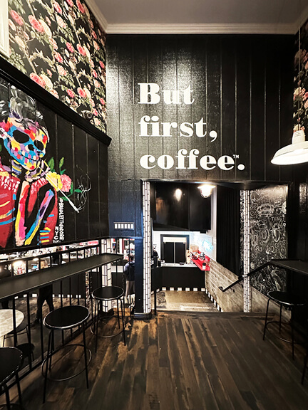
Alfred: But First, Coffee
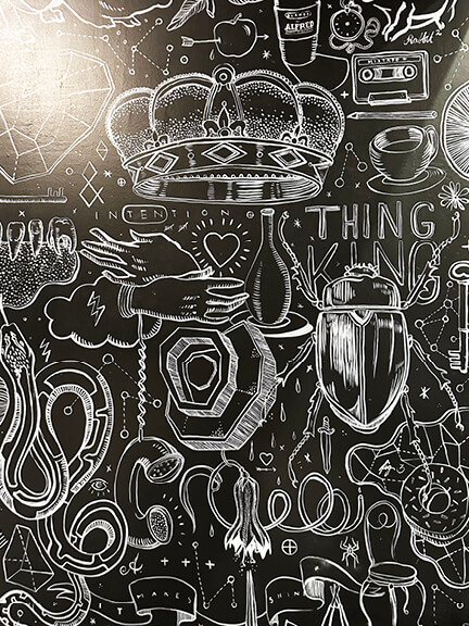
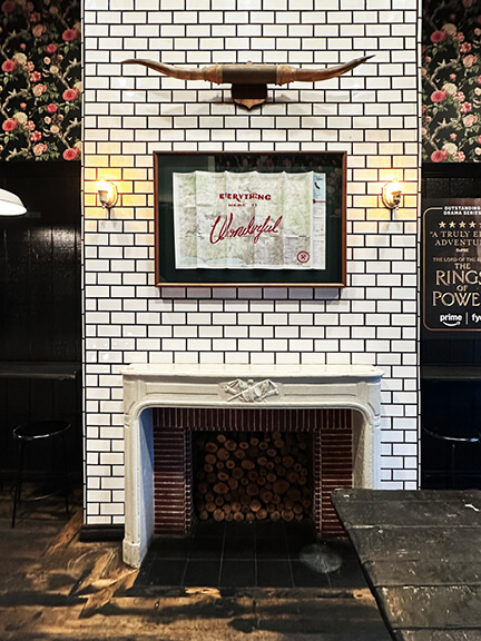
Alfred’s was a quick morning stop before diving into the day—but first, coffee. Always. The shop is tucked below street level, with a basement storefront that feels both hidden and buzzing. You walk past a historic-style fireplace framed by white subway tile with black grout—simple, sharp, and graphic. The surrounding walls are covered in layers of graffiti-style art. But it doesn’t feel random. More like, curated chaos…
I’m loyal to Americanos, and this one didn’t disappoint—strong, smooth, and (shocking) cheaper than anything I’ve found in Boston.
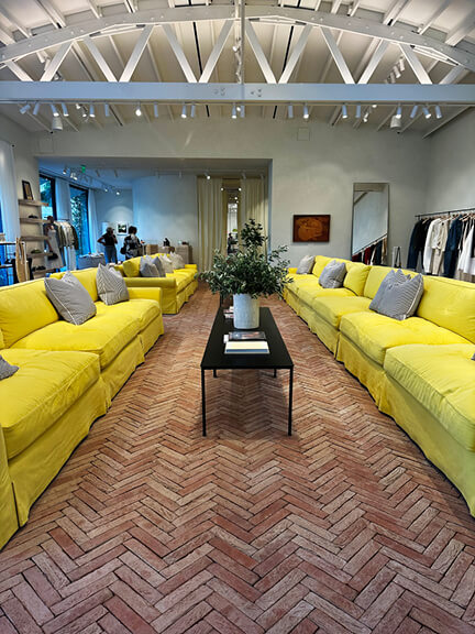
Jacquemus: Terracotta Floors and Yellow Sofas
Jacquemus is very new and hard to miss. First, the floor: natural terracotta laid in a classic herringbone pattern, like a rustic brick—but elevated. Then the ceiling height hits you. It’s open and airy, with structure exposed above a spacious, sunlit layout. And finally, the furniture—a series of bold yellow sofas lined up like sculpture, stretching from the front of the store to the rear wall (like a runway). I assumed it was the perfect perch for the husbands and boyfriends of serious shoppers.
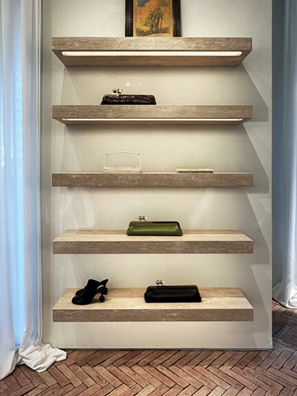
Along the perimeter, shelves fill nearly every wall. All custom. All different. One is minimal—just floating stone ledges that hold shoes and bags like art. Another is a clean-lined metal frame with simple white shelving. And the last, a sculptural plaster piece with unexpected legs and a heavy, architectural feel—like a 3D extension of the brand itself.
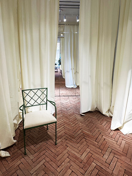
The dressing rooms aren’t rooms at all—just a loose formation of oversized white linen drapes, gathered to create private spaces. Small wrought iron chairs sit nearby, ready to hold bags, shoes, or whatever else you tossed aside in pursuit of something better.
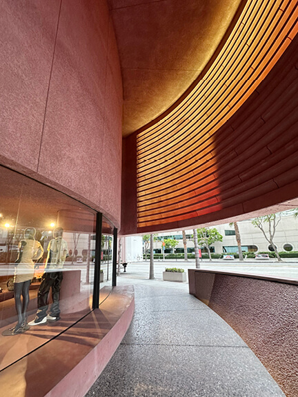
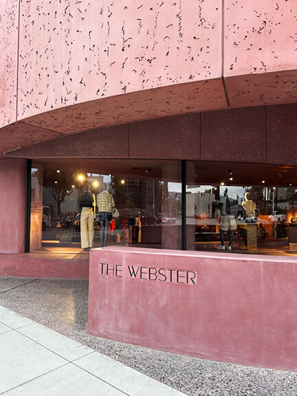
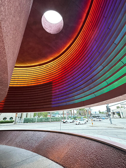
The Webster: Pink Concrete and Sculptural Retail
The Webster is known for its eye-catching pink architecture, and the LA location doesn’t disappoint. Designed by AD100 architect David Adjaye, the West Hollywood boutique sits at the edge of the Beverly Center with unapologetically modern architecture. While the Toronto store lives inside a historic building, this one sits in West Hollywood—all sexy curves and pink concrete. Color aside, the branding stays subtle: simple gilded lettering on the storefront, nothing flashy.
Beneath a dramatic overhang, pink concrete forms sculptural seating and a small water feature. Above, it gets even bolder—rotating lights wash the pink façade in shifting tones, from warm golds to full-spectrum rainbow. One detail I loved: a rounded skylight tucked high above the entrance.
Inside, the material palette continues with rough plaster walls, bold terrazzo, and built-in displays that blur the line between furniture and sculpture. Part gallery, part boutique, and unmistakably tied to place; every corner pulls your eye.
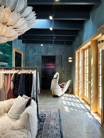
The Great: Lived-In Layers and Cardigan Collecting
The Great blends comfort with color in a way that’s both deliberate and unexpected. Art Deco light fixtures hang high above, their petal-like forms softening the dark blue ceiling. The ceiling structure stays exposed, painted to match the deep blue plaster walls. Those walls are layered—dark at the base, lighter above—with real texture and movement.
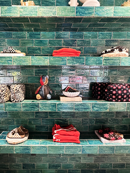
A small kids’ nook catches your eye with a massive sculptural swan—strange and wonderful. The rest of the space is all about ease: vintage area rugs, shag-covered furniture, and layouts that invite you to stay. One central zone features greenish aqua zellige tile. It forms floating shelves, stacked with clothing and branded goods.
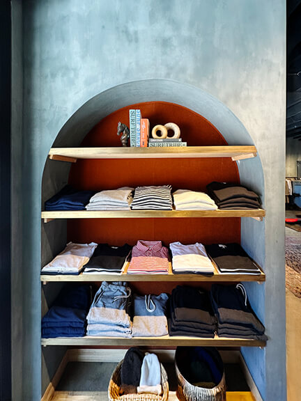
Another section is quieter. More plaster, more depth, with a soft arched detail above floating wood shelves. It’s retail, yes—but also a mood. I appreicate the brand’s aesthetic, described as having a “lived-in” feel, with a focus on comfortable, versatile pieces that can be easily incorporated into an existing wardrobe. Took home a sweater and denim—might officially be a collector of The Great cardigans at this point.
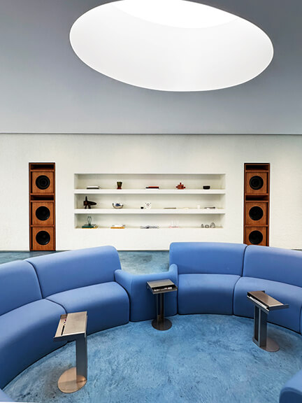
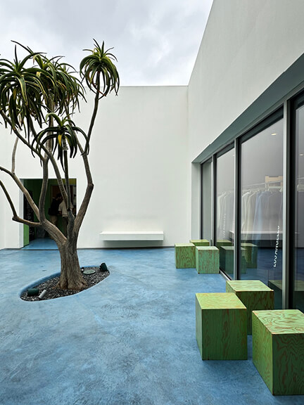
Madhappy: Blue Floors, Skylights, and $150 Sweatpants
Madhappy was the coolest surprise, and maybe my signature mood. Not a brand I knew, but home to some of the best beach gear I’ve found. I’m a sucker for beach sweatpants—if you know you know.
Let’s talk about the space. The interior features blue-stained concrete floors and a sunken living room, full of 70s-meets-California energy. A matching curved sectional, fully upholstered in bright blue, wraps the lowered seating area. Overhead, a circular skylight mirrors the shape below. Everything feels intentional.
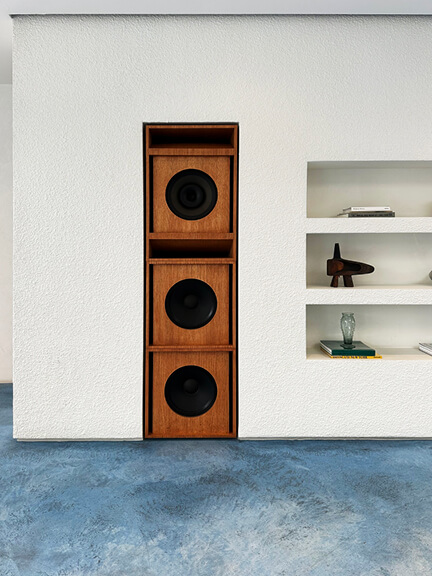
Toward the back, plaster shelves hold product in clean-lined formations. The far left and right corners each house massive speaker towers—yes, the music matters here. The sound, the materials, the layout—it’s all part of the experience.
Beyond the main space, a hidden courtyard continues the vibe. Same concrete floor, same blue tone, more texture. A live tree grows in the center, framed by green block-like seating and open-air design. On an overcast day, you could hardly tell the sky from an actual ceiling. At the very back, a coffee bar. No pastries, no frills—just a serious espresso setup and all the caffeine basics. Natural wood speaker casings flank the area, tying the whole concept together.
Cool interiors, strong coffee, and yes—I bought the $150 sweatpants. Worth every penny.
Inspired Interiors, Good Coffee, and a Few Too Many Receipts
We came for the food, stayed for the architecture, and left with full phones, caffeinated hands, and probably one too many receipts. Los Angeles shopping and dining may sound like a guide—but it’s really a visual experience. These stops made us slow down, look closer, and enjoy our time in West Hollywood a little more.
As always, the best days start with a strong coffee and end with a new favorite cocktail. In between, we found thoughtful lighting, sculptural furniture, and bold material choices—reminders that the best design doesn’t just live in showrooms. Not photographed, but worth a stop—if not for the design, then definitely for the goods:
More Design-Forward Retail Worth Visiting
- Glossier: Soft lighting, sculptural displays, and that famous millennial pink
- James Perse: Weathered wood, concrete floors, and perfectly undone minimalism
- Jenni Kayne: Earthy textures and coastal neutrals in a quiet, gallery-like space
- Alo Yoga: Polished concrete, double-height ceilings, and an entry lobby that feels more boutique hotel than activewear store
- Fred Segal: Industrial shell layered with color, art, and decades of retail history
- The Row: Stark, serene, and architectural—like shopping inside a Richard Serra sculpture
- The RealReal: Bright, buzzy, and packed with people—clean lines and smart lighting keep it feeling elevated
- Rag & Bone: High ceilings, exposed structure, and just enough edge to match the brand
- Bottega Veneta: Warm wood, dramatic shadows, and gallery-worthy merchandising
- Carolina Herrera: Classic bones with crisp detailing—feels like a couture salon reimagined for LA
- Oscar de la Renta: Refined paneling, neutral palette, and an unmistakable sense of polish
- Isabel Marant: Minimal, moody, and textural—concrete floors, blackened steel, and that effortless Paris-meets-California feel
More LA Spots Worth Exploring
- Three Landmark Historic Homes In LA: From Frank Lloyd Wright to Schindler, this tour spans Los Feliz to East and West Hollywood—three iconic homes with international acclaim.
- Historic Architecture Throughout Los Angeles: Tour neighborhoods across LA, from Spanish and Mediterranean Revival homes in Hancock Park to storybook cottages in Windsor Square, a Victorian mansion in Angelino Heights, and Arts and Crafts gems in West Adams. Add in infamous landmarks like the Chateau Marmont, the Beverly Hills Hotel, and the hills of Santa Monica—plus architectural standouts in Pasadena and Los Feliz. It’s a sprawling city with layers of history and no shortage of architecture to explore.
- Interior Design Showrooms: Peruse design showrooms—some exclusive to the trade, others open to enthusiasts—offering everything from hand-painted wallpaper to handcrafted area rugs. There’s no shortage of home inspiration. Many spaces also sell housewares and decor you can purchase on the spot—not everything is high-end furniture only.
Travel always refuels my work as an interior designer. I come home with fresh material references, smarter space planning ideas, and a renewed sense of balance between bold design and everyday living.


