High Expectations
Kensington Palace came with high expectations in my book. I’m not obsessed with the royals, but like everyone else, I can’t look away from a Harry scandal or Kate Middleton’s perfect wardrobe (and hair). My mother adored Princess Diana, and as a kid in the ’90s, I remember her death clearly. All of that history sits in the background, so visiting Kensington Palace—the home tied to every one of these figures—felt exciting.
The tour starts in the formal King’s Apartments, elegant but completely unrelatable, aside from a few standout art and sculpture moments. The Queen’s rooms feel easier to understand, though still a little disappointing. Why is her suite less impressive than his?! Total feminist reaction. The final stretch, the more lived-in rooms from later periods, became the most inspiring. These spaces hold the kind of details that translate into modern interiors, which is always the point of my museum visits. Design tourism. Collecting ideas from afar and carrying them back into the projects waiting for me in New England.
The Exteriors
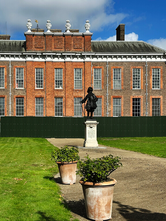
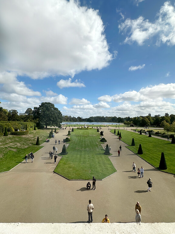
Approaching Kensington Palace, the red-brick façade appears first. Straightforward, warm, and rooted in early-Georgian proportions. The brick shifts in tone, so the elevation never looks flat. Tall windows then break up the massing in a steady rhythm, and the gilded gates frame your path across the lawn. As you move closer, the building reads clearly, and the scale becomes more apparent. The middle photo, seen from the Queen’s Apartments, shows the grounds extend along a formal axis.
At the main entrance, the brick shows its full range of reds and browns. These variations add depth and tie the façade together. White trim outlines the windows and doors, while the sage green entry sits comfortably against the warmer masonry. A simple dentil molding defines the cornice and completes the elevation with a clean, architectural finish. Green and red, but with none of the holiday cliché.
The King’s State Apartments
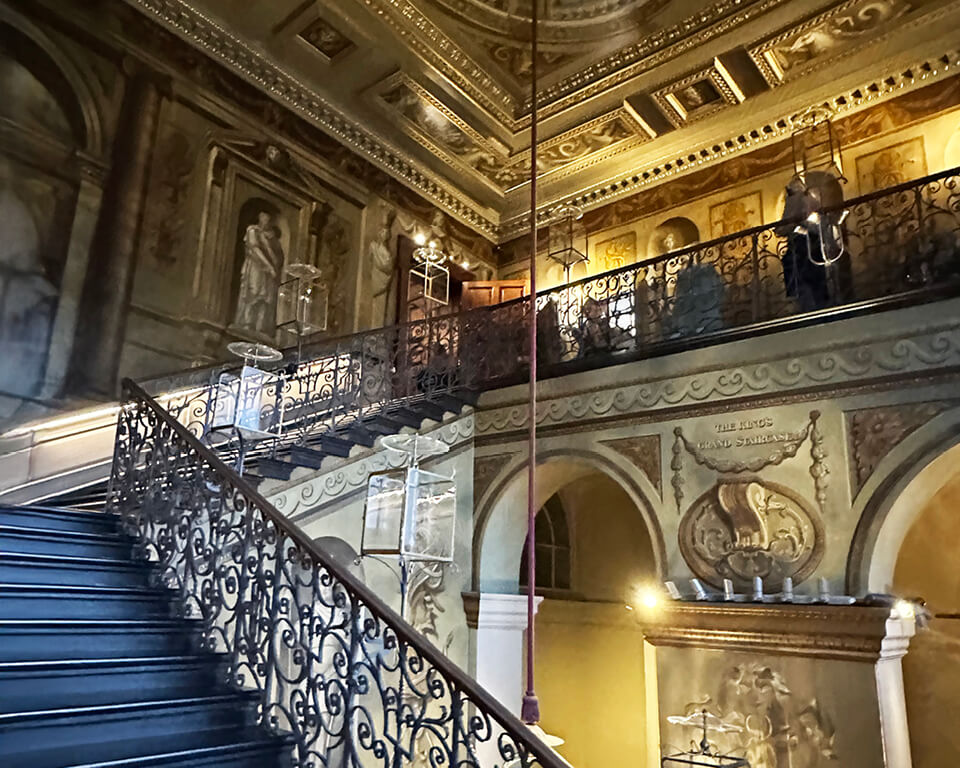
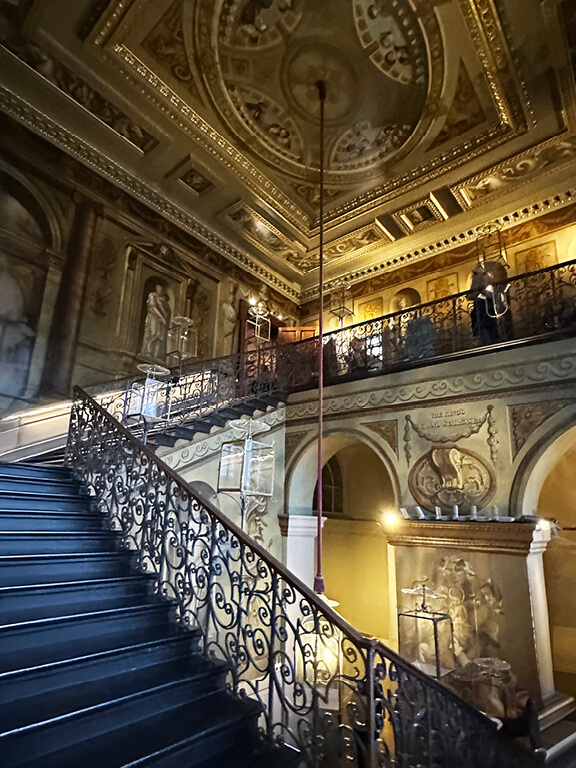
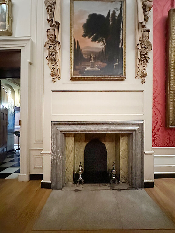
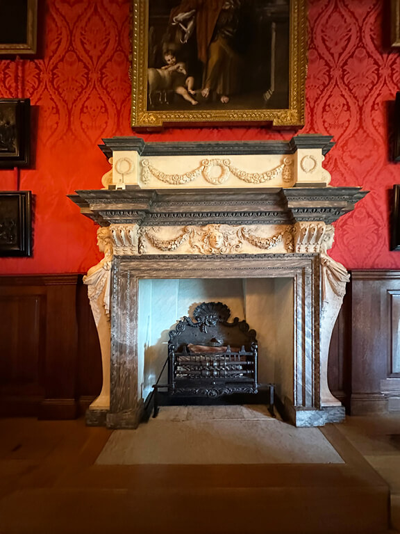
The King’s Staircase sets up the formal sequence built for George I. Wren designed the structure, and William Kent painted the walls in the 1720s. Kent added life-size figures from the early Hanoverian court, and they stand along the landings as if they belong in the house. Painted coffers and trompe-l’œil details stretch across the ceiling and show Kent ‘finding’ his early style. The iron balustrade follows the scrollwork common in English metalwork of the period and guides you up the stair. In the next room, the fireplace shifts the focus back to Wren’s cleaner architectural language. Variegated marble forms a simple classical surround, and carved Baroque figures frame the overmantel. The Italianate landscape above reflects the early Georgian taste for idealized views. Raised paneling and the damask nearby finish the wall and bring the whole composition together.
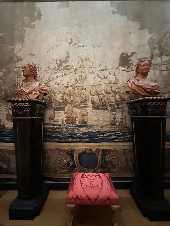
The nautical tapestry nearby comes from a late-17th-century naval series that records major English sea battles. Wool and silk threads shape the blues, creams, and ochres, and the scene shows the fleet with a clear sense of movement. These tapestries often appeared in state rooms to underline political or military strength, so the placement makes sense. Two portrait busts stand on ebonized pedestals and usually represent monarchs or commanders tied to the battles shown. The grouping works as both a historical reference and a structured decorative moment. Together, the tapestry, the busts, and the marble details echo the formal character of the King’s Apartments without feeling cold or unreachable.
Red Damask
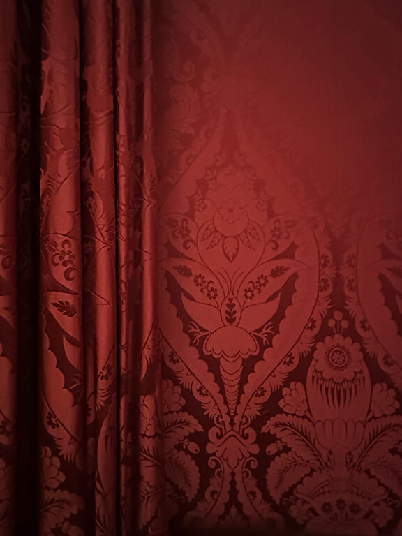
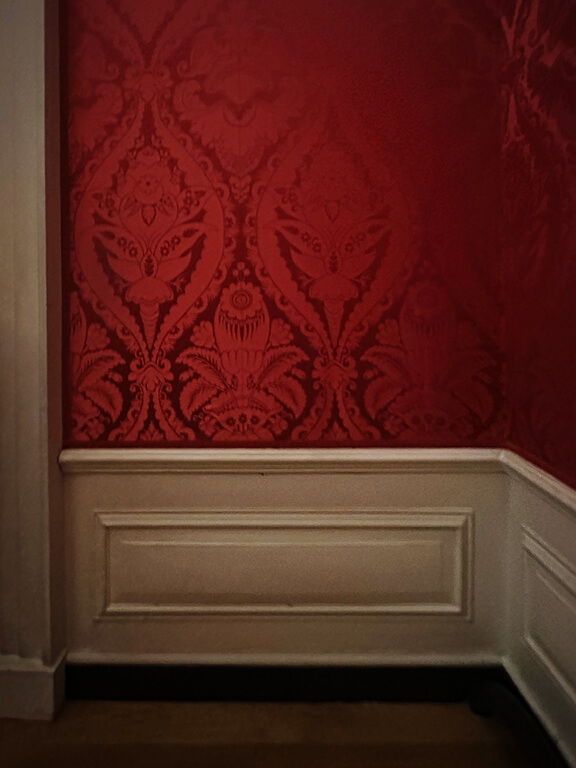
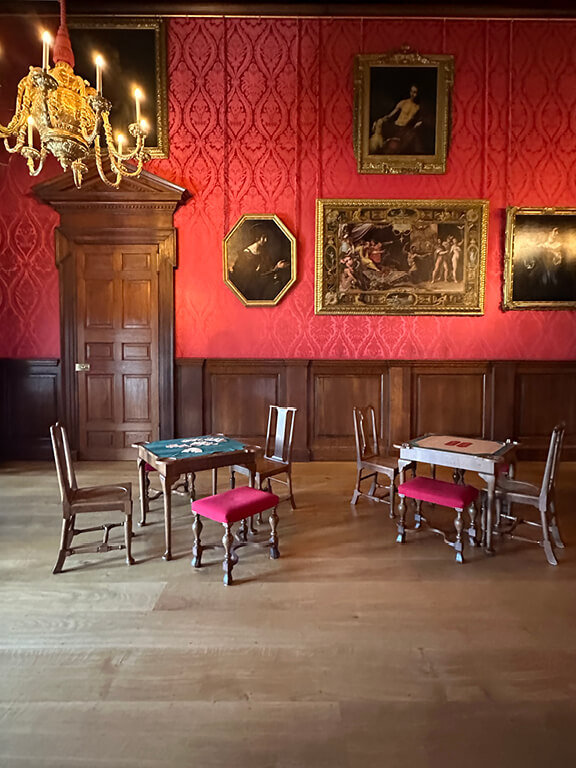
The next rooms in the King’s Apartments lean hard into red damask—the kind of saturation you only see in royal interiors. Silk panels wrap the walls, and the matching drapery deepens the color even more. The textile hits a clean contrast against the white painted millwork, which frames the openings and keeps the architecture clear. In the adjoining rooms, the palette shifts again as natural wood paneling comes in, giving each space its own tone while still following the larger sequence. Every room holds a grand marble fireplace, each one shaped with strong classical lines. Their scale does the talking and signals the status of the rooms. Across the suite, the mix of textile, wood, and stone creates a steady rhythm within the State Apartments.
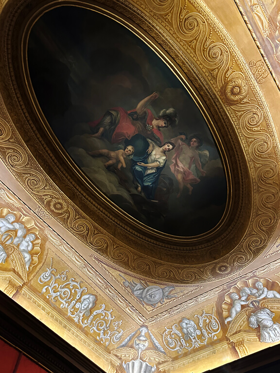
Sculpture appears throughout these rooms, and many pieces draw from Greek and Roman sources. Busts on marble pedestals line the walls and add vertical weight that balances the damask. These works reflect early Georgian collecting habits and link back to the architectural language of the period. Overhead, an oval ceiling painting marks William Kent’s redesign of the King’s Gallery between 1725 and 1732. He handled everything—architecture, plasterwork, panels, and furniture—and the suite still shows his integrated approach. Another tapestry hangs along the far wall, and its woven detail sits comfortably within the millwork. Together, the textiles, carved stone, classical sculpture, and Kent’s ceiling create a clear hierarchy and reinforce the formal character of these rooms.


The Cupola Room a la William Kent
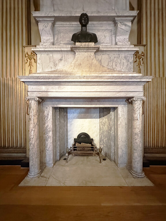
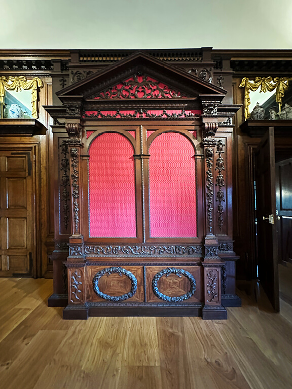
The Cupola Room at Kensington Palace shows William Kent’s hand everywhere. He wasn’t the star designer of his time, but he was talented, ambitious, and more affordable. I love that the palace trusted their instincts and hired him instead of chasing the biggest name in the industry. In this room, fluted columns with gilded paint rise along the walls and meet the natural wood floors. Then the marble architecture takes over, starting with the arched portal at the entry. Another marble structure sits across the room and supports a gilded sculpture that catches the light. The fireplace remains my favorite moment. I love a historic fireplace, especially one with Kent’s Grecian columns and the ornate details that spill into the surrounding décor.


More Red Damask
The red damask sets the tone in the King’s Gallery and links each room through color and texture. The architecture shifts as the suite unfolds, yet the fabric keeps a steady rhythm. One room uses natural wood wainscot that softens the walls. Another relies on white and gold paint that sharpens the contrast and pushes the damask forward. These rooms once hosted constant parties that looked glamorous, but the realities behind them were not.
The King’s Gallery is the largest of the State Apartments and still reflects the design completed for George I in 1725. A working dial sits above the fireplace and connects to a wind vane on the roof. William III used it to track wind direction and estimate the movement of his navy. He also watched it to guess when the post might arrive. A large map nearby shows Great Britain and France as equal in size. That comparison was an optimistic error mistake since France is nearly twice as large.


The Queen’s State Apartments
The Queen’s side of the palace takes a quieter approach than the King’s State Apartments. The rooms rely on wood paneling rather than gilded surfaces or silk-covered walls, which reflects their original purpose as private apartments rather than ceremonial spaces. The simpler finishes held up to daily use, stayed warm in low light, and aligned with the more intimate character of this wing.
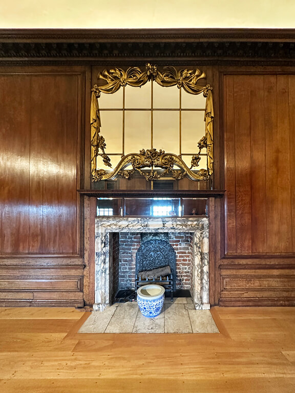
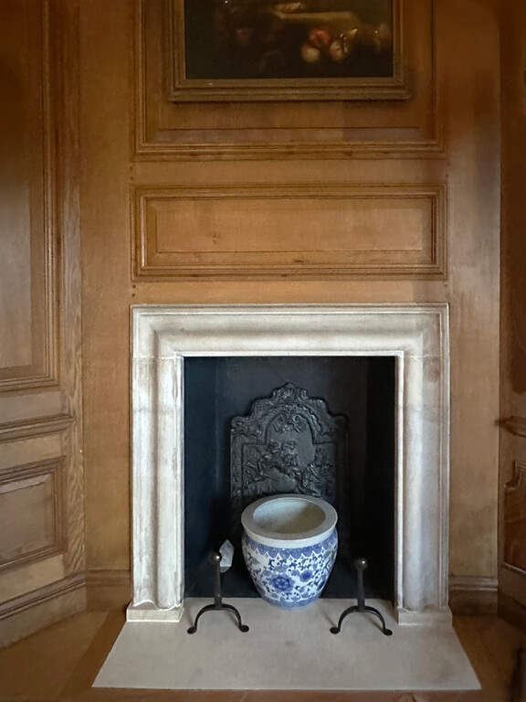
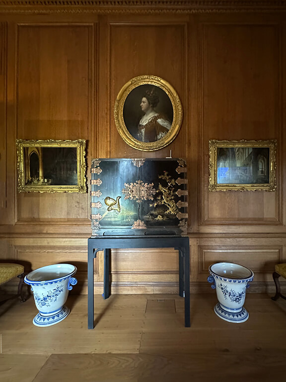
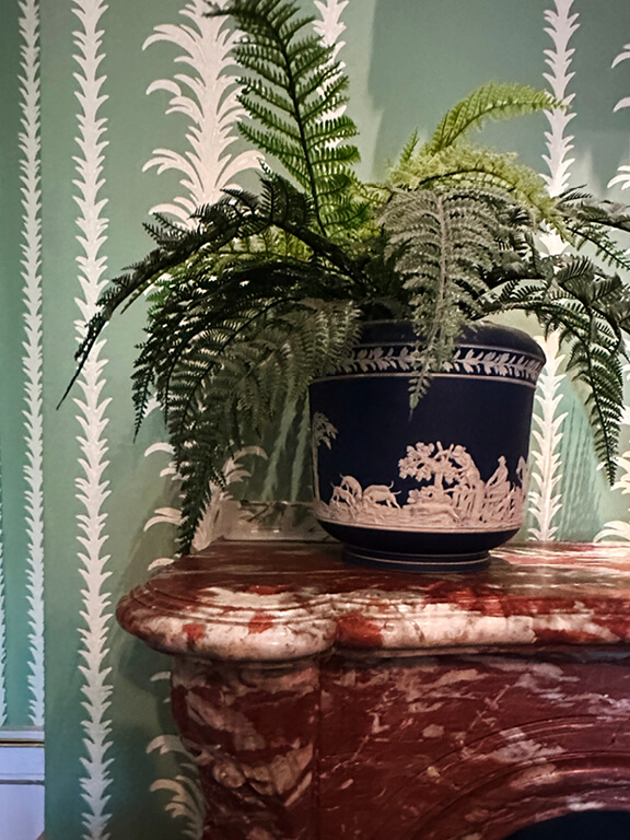
Delftware and other blue-and-white ceramics appear throughout these rooms, a clear nod to Queen Mary II’s well-known passion for porcelain. She collected both Asian imports and European Delftware, and she used these pieces to bring color and pattern into her more personal spaces. The ceramics add refinement without the formality of damask or gilt, which suits the understated architecture of the Queen’s apartments.

Soft Pink Damask
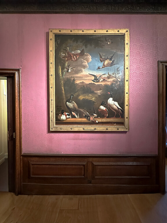
The Queen’s Gallery stands out for its soft pink damask, a re-creation of the early-18th-century wall coverings. The room pairs that textile with low oak wainscoting, which gives the gallery a warm base and sets it apart from the more formal Presence Chamber and Drawing Room. The walls carry still lifes, game birds, and landscape paintings, a nod to Queen Mary II’s taste for natural subjects. A marble fireplace anchors the long wall and creates a focal point for the art above it. Designed by Sir Christopher Wren and decorated by William Kent, the gallery served as a long promenade room meant for display, movement, and quiet ceremony. The combination of damask, oak, and curated artwork still defines its character today.
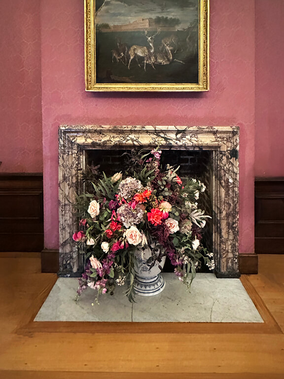
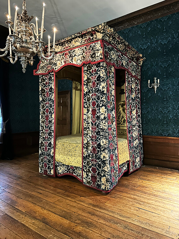
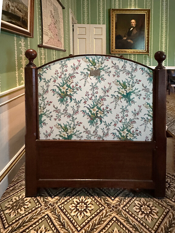
A short walk from the Queen’s Gallery leads to the room associated with Queen Victoria’s birth, although she was actually born in the adjoining dining room—an odd choice, but still part of the palace’s story. The space holds strong visual appeal, especially for anyone who loves the look of Southern-style bedrooms with velvet bed curtains, rich trim, and a bold accent color on the bedding. The light yellow on the canopy pops against the blue upholstery, and the teal wallcovering, while not original, reflects the palette of the era. The room leans dark and moody, which suits the historic architecture. And nearby, the spaces continue the visual rhythm with its pink damask, a hallmark of the Queen’s State Apartments.
Victoria’s Childhood Rooms
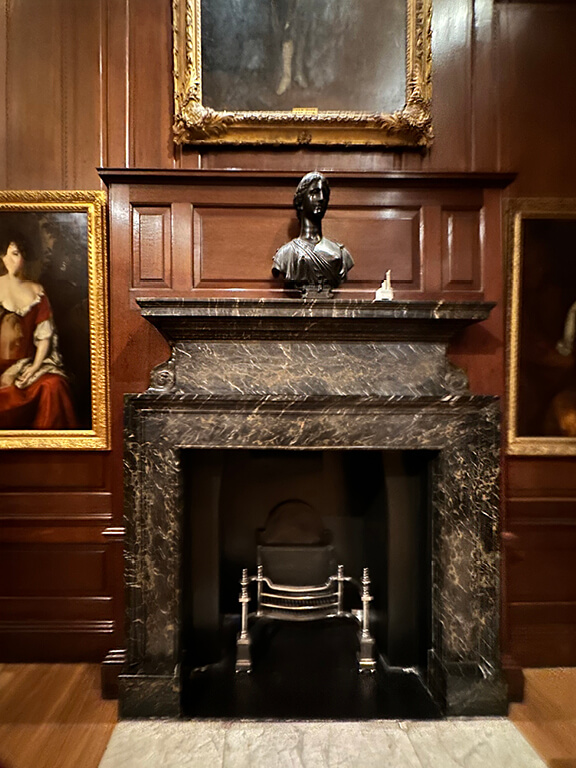
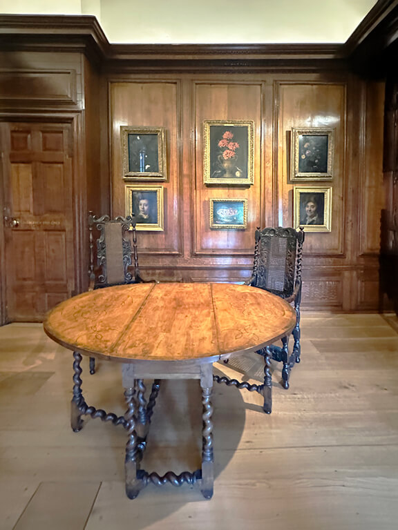
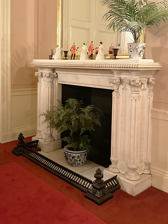
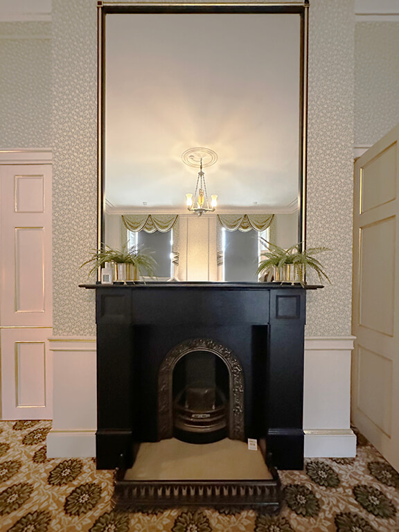
The next section of the palace is presented as Victoria’s childhood rooms, and the spaces feel more modern and lived-in than the earlier State Apartments. Some interiors in this wing were updated over time, and it’s likely that later members of the royal family occupied parts of this suite, which explains the shift toward a more relatable scale. The fireplaces follow the same idea. Each surround is marble and beautifully detailed, yet they step away from the grand architectural structures in the ceremonial rooms.
The design here stands out for its quiet strengths. The ceiling molding has a refined profile. The wall colors stay subtle and allow the furnishings to shine. The wallpapers, the wainscot, and even the placement of the decor on the mantels feel thoughtful. A black fireplace with a stately mirror creates one of the strongest focal points in the suite. The upholstered bed anchors the room with shape and softness—an easy reminder that any upholstered piece always wins in a historic interior.

Good Work Can Outlive Trends
Kensington Palace leaves you with a few surprises, but the biggest one is William Kent himself. He wasn’t the star designer of his era, yet he shaped rooms that still pull thousands of people through the door every day. I relate to that. I’m not the loudest name in the industry either, but the underdog in me can’t ignore the idea that good work can outlive trends, salaries, and hype. Maybe my projects won’t sit in a palace, but a small-business designer can dream.
The design lessons stick even more. A fireplace can hold the focal point of a room and deserves bold details. A patterned floor or wall can shift the entire mood. Beautiful molding—always—does heavy lifting. These elements create lasting moments in any home, whether it’s a royal residence or a brownstone in Boston. If this kind of design tourism hits a nerve, read more about how we study historic interiors and how those obsessions shape the work we bring back to New England.


