
The Cartier Mansion New York
The Cartier Mansion in New York has been on my mind since visiting the exhibition at the V&A in London. Spending time with the family history in my current read deepened that interest, and I have always been drawn to turn-of-the-century mansions. Built in 1903 on Fifth Avenue, the New York City flagship remains a luxury retail destination while still reading like a well-designed private home, and beyond the jewelry and accessories, the interiors tell a sophisticated story. Tile, carpet, furniture, and wall treatments work together across all floors. The spaces feel grounded in New York, with a clear European influence, an outcome that feels natural for a Gilded Age home of this scale. French references appear throughout, and the design as a whole reflects what a long-established brand can carry forward.
Layered History
What began as a Gilded Age residence soon entered retail history. Cartier opened its first New York store here only a few years after the construction. At the time, Fifth Avenue was already shifting. Private homes gave way to commercial use as wealth moved north, and the building has carried the Cartier name ever since. Over a hundred years later, the most recent transformation arrived in 2023, led by Laura Gonzalez. The historic residence retains its character while undergoing a full interior reworking. The result blends carefully selected styles and materials where spaces feel layered rather than overwritten. New interventions sit comfortably within the existing structure, and the project treats the house as a framework as opposed to a backdrop.
Laura is a Paris-based interior designer whose work sits between decoration, craft, and fine art. She trained in architecture before turning to interiors, which informs her sensitivity to scale and proportion. Her practice draws heavily from French decorative traditions, particularly surface treatment, textile use, and artisanal production – you will see all of this at the flagship store. Gonzalez is known for working closely with craftspeople on custom carpets, mosaics, metalwork, and furniture. Pattern and color play a central role in her interiors, often layered across floors, walls, and upholstery. Rather than pursuing minimalism, her work embraces richness and detail while maintaining control and balance.


Enrtrance & Flooring
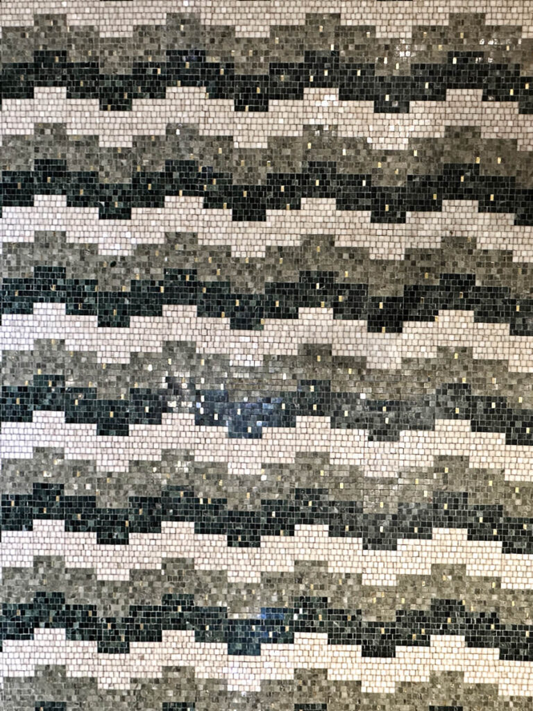
The entry signals historic roots, but it reads light and controlled. Classic architectural millwork frames the space. Whether original or not, it belongs. Curved niches with white trim hold wall-mounted shelves. Handbags, clutches, and sunglasses appear curated rather than displayed. Below, a curved onyx console anchors the wall. Mosaic tile rises behind it, connecting directly to the floor. Lamps and objects sit casually, reinforcing the feeling of a grand foyer of someone’s home.
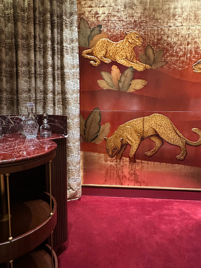
A sun-centered mosaic blends white, off-white, and soft gold. The motif recalls classical precedents, from Louis XIV (the Sun King) to Roman floors to Beaux-Arts buildings and early twentieth-century interiors. Moving deeper into the building, the mosaic shifts to green and neutral white. Offset squares introduce geometry. Nearby, bold wool carpeting adds black and white. The patterns differ without competing. Together, they establish a residential rhythm rather than a retail one.
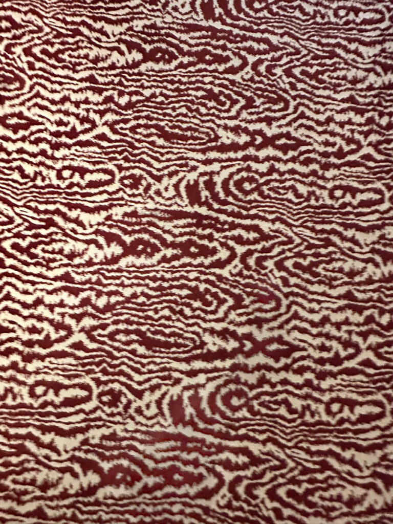
Leading from the mosaic toward the stair, a floral carpet appears in subtle neutral tones against a dark green ground. The print introduces a softer, more feminine note. On the upper floor, a maroon and off-white faux bois pattern follows. The palette feels considered, where it stays light enough to avoid heaviness, patterned enough to disguise wear. The introduction of red stands out, and throughout the building, color appears deliberately varied.

Grand Staircase
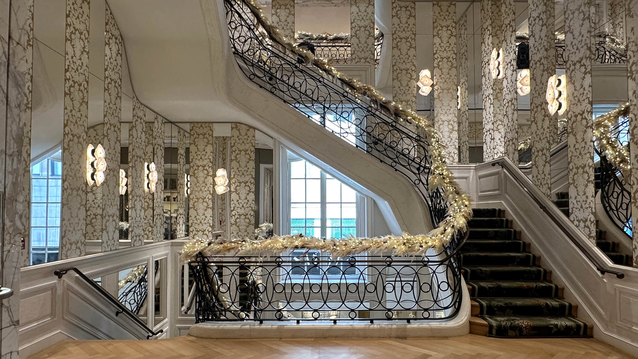
One photo cannot capture the experience of the staircase, but it is worth trying to describe. It feels original in spirit, limestone steps anchor the structure. Wrought iron railings curve upward with precision, using circular geometric patterns. They may not be original, but they feel like a contemporary interpretation of something that once belonged. Wood flooring introduces chevron rather than herringbone, and the walls define the moment. Strips of mirrored panels alternate with classic damask wallpaper as modern sconces sit directly on the mirrors. Their raw, stone-like forms multiply through reflection and amplify the light, the reference feels appropriate here.
Living Room Interior Design
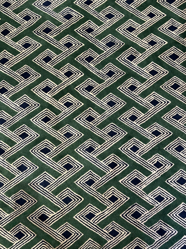
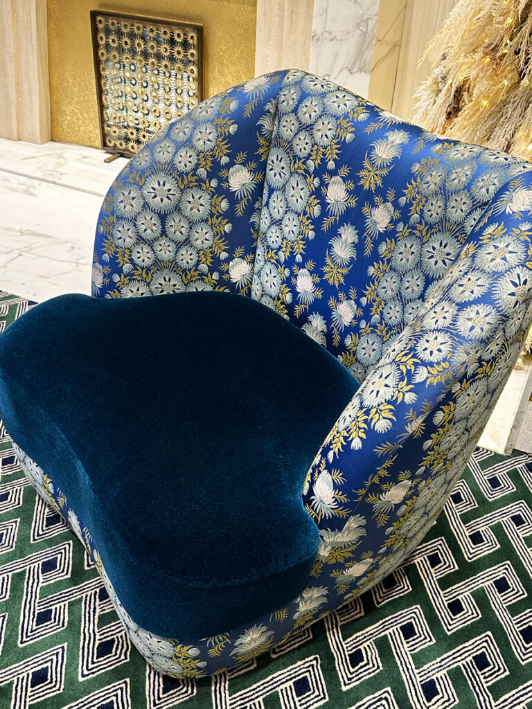
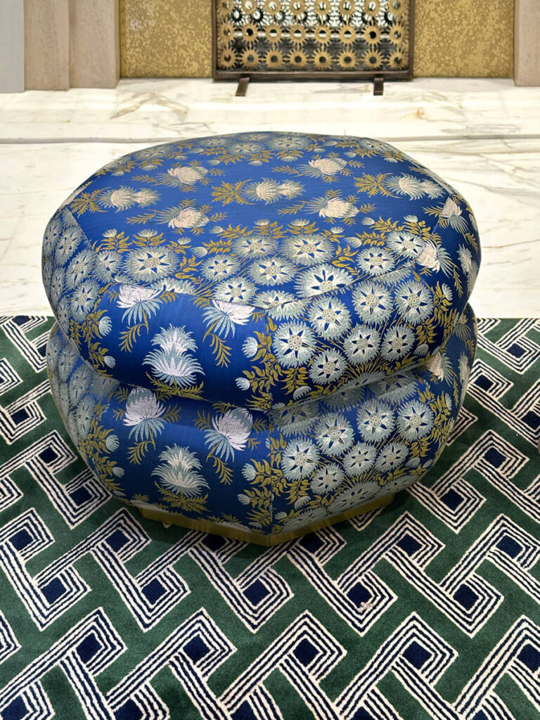
Each floor includes what I describe as a a living room, where the residential feeling of the store come to play. Geometry returns on the floors. Red circular motifs feel modern on one area rug, paired with a green velvet sofa that anchors the room. An organic marble table softens the palette, and a chandelier above leans French. Curved tub chairs and an ottoman complete the seating. The ottoman is sculptural, and along with the chairs are a recurring theme through the entire building. Bold fabrics, at times velvet, always offering a perch for sitting or for one’s bag. By contrast, the walls appear as light-stained oak rather than the darker wood typical of a Gilded Age home. A single wallpaper panel reads like art itself, and gives way to a classic portrait – mixing of the old and the new. The entire room is softened by the drapery, with light weight sheers that filter sunlight.


Classic Wall Treatments
The wall treatments stand out immediately, and original wood appears throughout the building. On the upper floors, a jib door disappears seamlessly into the millwork, one of my favorite moves. Arched areas receive wallpaper treatments that break up the warmth of the wood. Some panels resemble antique mirror. Others read as abstract blue pattern, overtly modern touches that bring the spaces into the 2020s. Chevron floors return, and small meeting areas feel intimate, again reading like someone’s fabulous living room.
Beyond, a smaller room feels like a private closet. A curved sofa sits quietly in neutral velvet, anchored by a blue curved rug. The walls combine millwork with textile wrapping, creating a softened, quiet space. Unique sconces appear again, adding a feminine note and reinforcing the feeling of a dressing room. Cartier’s signature animal appears as artwork over a mirrored panel, while additional animals emerge in the fabric as birds.


Rewarding on Closer Look
Private rooms appear throughout the building and accommodate both large and small purchases. Each space is distinct, yet the overall design remains cohesive. In one room, moiré fabric wraps the walls and continues onto the doors. Side chairs match tonally, while golden area rugs introduce quiet pattern. Another room relies on a single green pattern throughout. Walls, drapery, and furniture align in full pattern drenching. Even the mirror is wrapped on its reverse, a detail easily missed but rewarding on closer look. Antique furniture finsihes each space.


Husband Chairs
Upholstery defines the interiors, where tiered poufs appear often. They read as sculptural rather than utilitarian, with color that feels playful yet sophisticated. Curved chairs dominate, often cut from the same cloth as the ottomans and contrasted with solid velvet and other luxurious materials. I always think of these as the husband chairs, placed with care and meant to be comfortable while one considers a purchase.
On the busiest floor at the top, where patrons have pieces serviced, cleaned, or repaired, a sage velvet sofa anchors the space, set on a red faux bois carpet. A café nearby serves coffee and drinks. In another area, a floral tub chair appears alongside an amber glass table. Throughout, modern elements coexist easily with classic French references.


The French Approach
This project succeeds because it feels personal, and the interiors reflect Cartier’s heritage with clarity. French influence runs throughout without cliché. The spaces feel exclusive, yet never intimidating. Beyond the jewelry, the interiors matter and they invite visitors into a world that feels private and exclusive.
The French approach here is instructive. Wrap walls and panels in fabric. Choose circular area rugs over rigid geometry. Favor curved tub chairs and sculptural ottomans upholstered in materials like matelassé and velvet. Use mirrors as architectural elements, not decoration. Embrace pattern drenching. Accept ornament as a given, not an exception.
While most of us will never own Cartier’s jewelry and accessories, the ideas remain accessible. Read the books. Study the imagery. Visit the Cartier Mansion New York. It remains the epicenter of American luxury retail shaped through a distinctly French lens. Read more about how travel and obsessing over historic homes—whether renovated by a French designer or not—continue to inspire our design work here in New England.


