
Mayfair Reimagined
Tucked into the heart of Mayfair on Grosvenor Square, The Twenty Two is a 31-room boutique hotel housed within an Edwardian manor. The building dates to the early 20th century, with double-height ceilings, ornate plasterwork, and classical proportions that set the tone for its grand yet intimate atmosphere.
The hotel sits at one of London’s most refined addresses, surrounded by Georgian façades, quiet gardens, and the discreet energy of Mayfair. Rated five stars, The Twenty Two blends old-world architecture with a modern design narrative led by London-based interior designer Natalia Miyar.
Miyar’s concept celebrates the building’s historic character while introducing a palette of deep blues, crimson velvets, and antique mirrors. Inspired by 18th-century French salons, her design layers jewel tones, bespoke lighting, and tactile fabrics to create spaces that feel both lavish and lived-in. Every corner reflects craftsmanship and personality rather than perfection, capturing the spirit of modern British luxury.
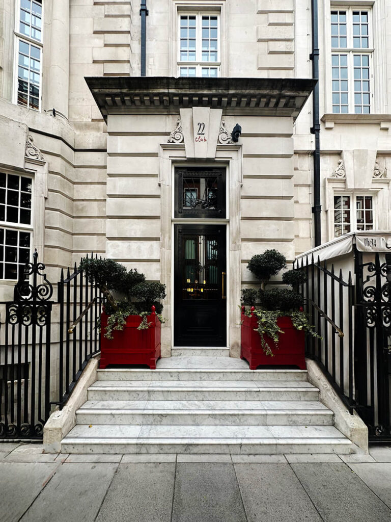
A Proper Entrance
At the corners and around the main door to the club, rusticated quoins form a strong visual frame. The alternating pattern of large and small limestone blocks gives the façade dimension and rhythm—an architectural detail typical of Edwardian townhouses in Mayfair.
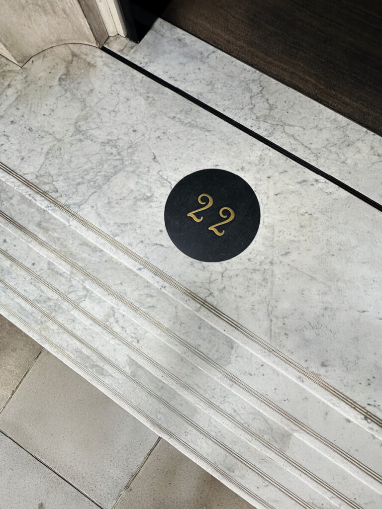
At the main entry of the hotel, centered between the stonework, the front doors sit over a black marble threshold, inlaid with a brass circle bearing the number “22” set into black granite. The dark surface contrasts sharply with the pale stone, creating a clear, elegant marker at the entry.
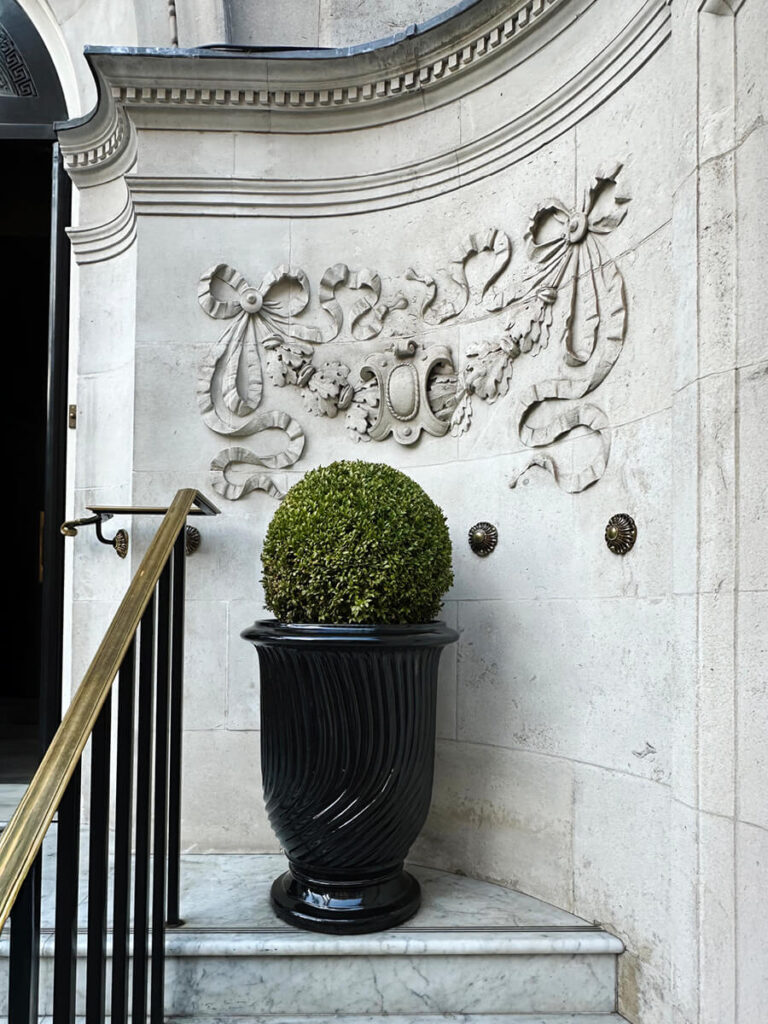
Beneath a delicate garland of bows and carved ornament—common in Edwardian architecture—a single topiary in a black urn anchors a seperate entry to the priavte club. The stonework features ribbons and foliage cut deep into the limestone, a motif revived from classical design and favored for its sense of craft. The carving catches light and shadow across the façade, softening the building’s strong geometry without losing precision.
Monochrome Welcome
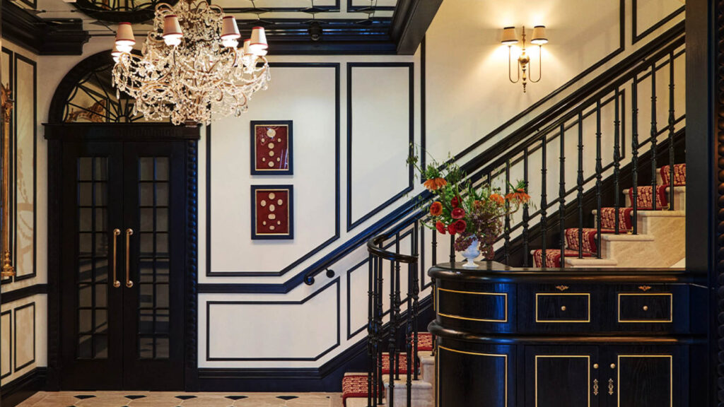
The foyer sets the tone right away with a black-and-white palette that feels classic and sharp. The stone floor sits in a crisp grid and leads you to a staircase with custom millwork and brass sconces that glow just enough. The reception desk stands out in black with gilded trim, and the crystal chandelier above it brings a bit of sparkle without trying to steal the entire show.
Simple artwork and a pair of French doors keep the space calm. Then you look up. The mirrored ceiling, framed in black squares, echoes the pattern on the floor. Everything lines up, everything feels intentional, and the whole room lands in that sweet spot between historic and just a little dramatic—in a good way.
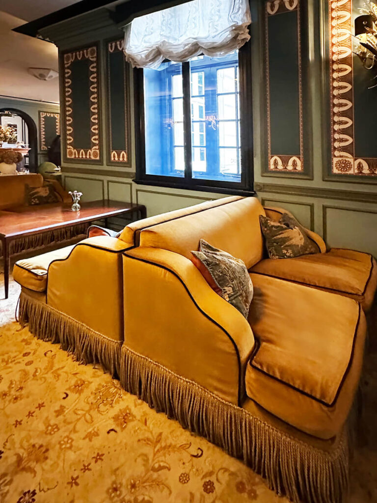
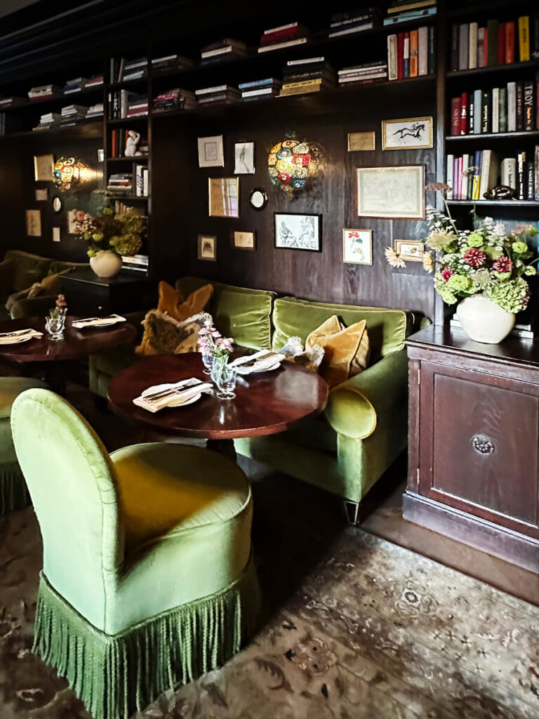
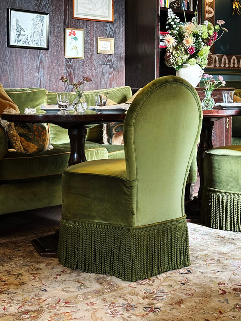
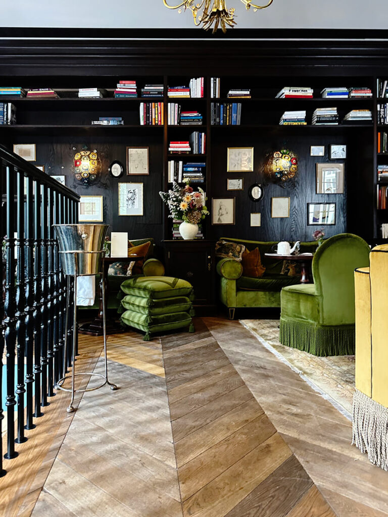
Morning Room
Just left of the lobby, the drawing room functions as a casual restaurant and bar reserved for hotel guests. Breakfast is served here each morning, with a mix of dining tables and lounge-style seating that encourages people to linger. Upholstered chairs in yellow and green fringe add color and comfort against the soft architecture.
The walls feature custom-painted panels and dark millwork that recalls a traditional library. Shelving lines one side of the room, filled with books and objects chosen to feel collected rather than styled. The effect is deliberate—a nod to an old English manor recreated with modern craftsmanship.
Austrian shades and tailored drapery frame the windows with a residential touch, while vintage rugs, ottomans, and small poufs layer texture and ease. The space balances the intimacy of a private home with the polish of a boutique hotel.


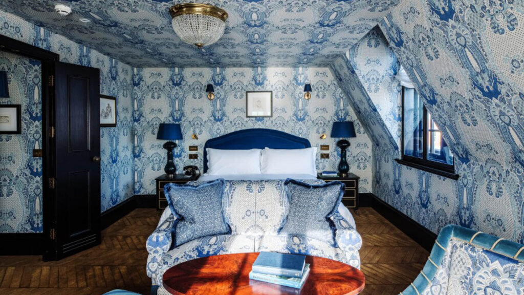
Wrapped in Pattern
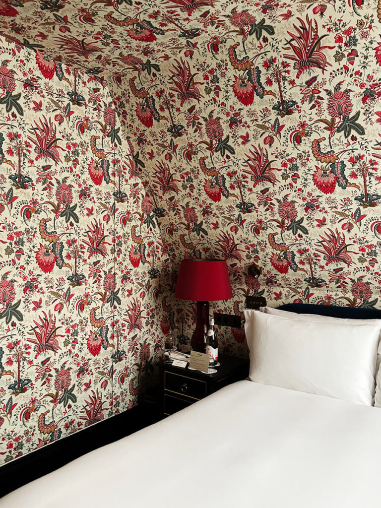
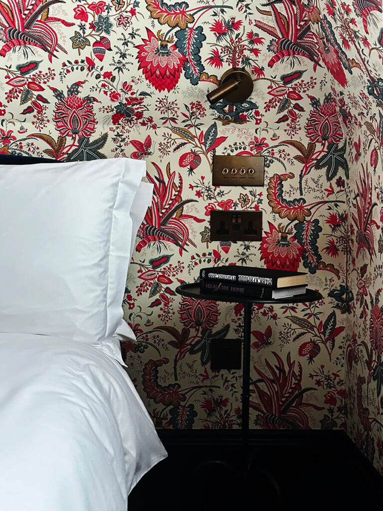
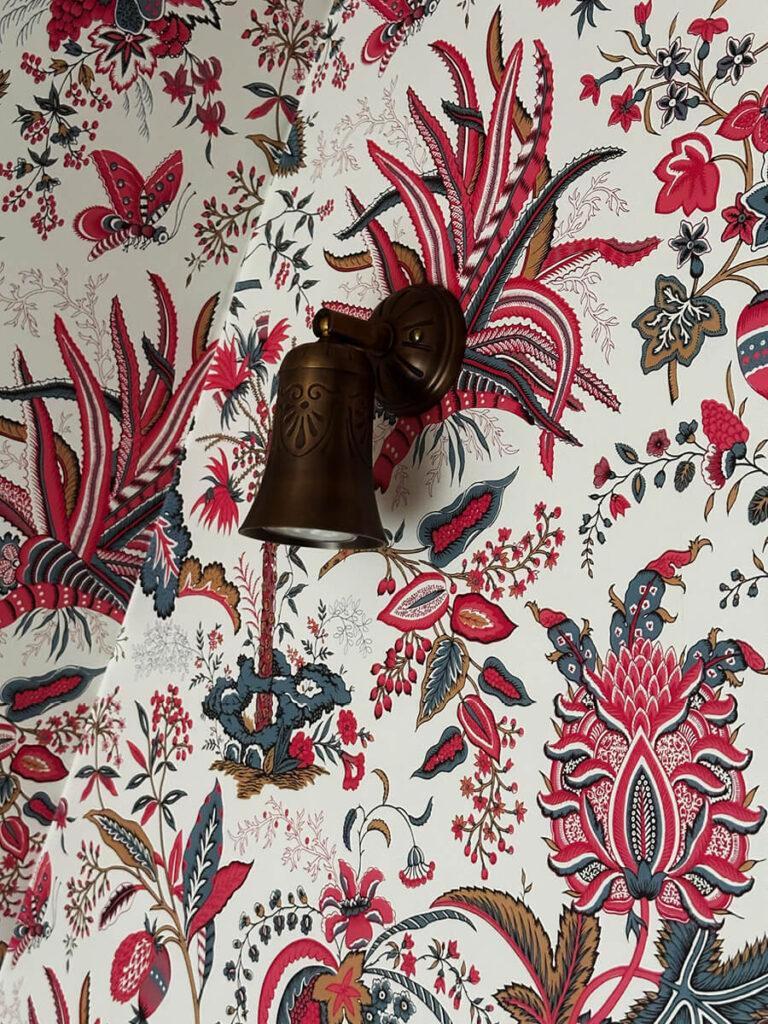
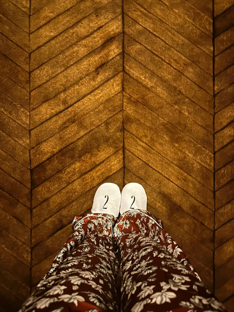
My room sat on the top floor, tucked beneath the sloped roofline—one of the smaller, more charming spaces, and I couldn’t have been happier. The design team wrapped the entire room in a classic floral wallpaper, traditional in pattern and tone. Every surface carried the print: the walls, the ceiling, even the access panels to the bathroom. The Roman shades matched perfectly, and in such a small space, the repetition felt intentional and bold.
Black-painted trim outlined the architecture and framed the pattern. The furniture was simple, allowing the walls to take center stage. A petite wall sconce in aged brass gave off a warm, diffuse light. A custom armoire—really a closet—had mirrored doors that reflected the floral design back into the room, amplifying the pattern’s effect.
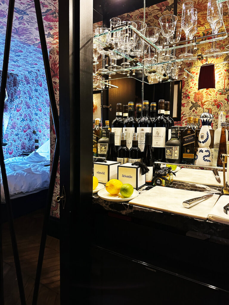
Inside, the minibar felt unexpectedly considered: fresh citrus, wine, tequila, mixers, and proper glassware—everything in its place. The final surprise was the custom carpet, a smart interpretation of old-world flooring. Historic homes like this once featured intricate herringbone or chevron wood floors—beautiful, but impractical for hotel use. Here, that geometry and color were recreated in broadloom carpet, offering the look of heritage with the softness of textile. It’s a clever and slightly risky design move, and it worked—the result felt luxurious, familiar, and deeply British.

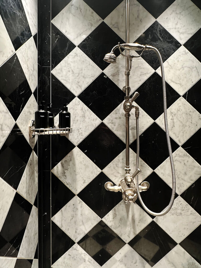
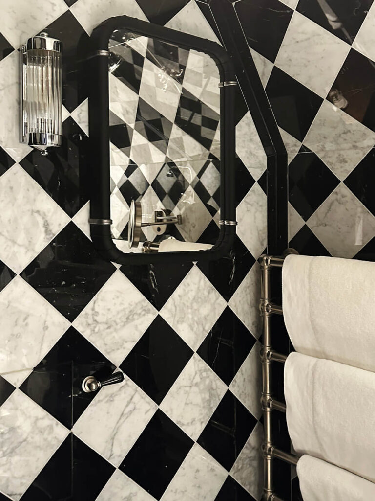
The Marble Moment
In the bathrooms, the black-and-white palette returns—a classic combination first introduced in the lobby. The designers used a bold mix of black and white marble throughout, extending the pattern seamlessly across the floor, walls, and even the ceiling.
As a designer, I appreciate the confidence in that choice. The material itself is modest—simple 12-by-12 marble tiles—but the installation transforms it. Arranged in a strong geometric layout, it creates a harlequin effect that feels both graphic and timeless. It’s proof that even the most ordinary material can achieve impact when handled with care. The result is striking: a compact space elevated by precision and pattern.

Color, Pattern, Repeat
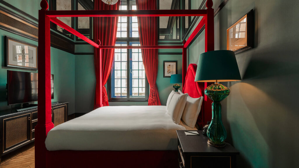
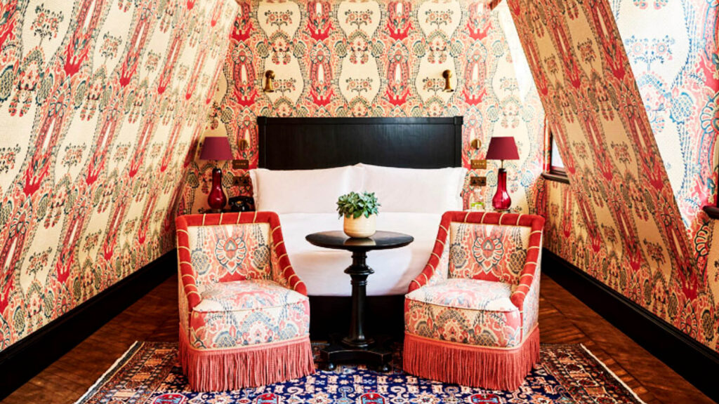
Beyond my top-floor hideaway, the hotel’s 31 rooms each have a distinct design. Not all are wrapped in wallpaper, but every one feels intentional and inspiring.
One of the boldest spaces features deep teal walls with a red statement bed—an unexpected combination that works beautifully. Another top-floor room, tucked under the slanted roofline, continues the “wallpaper everywhere” approach: walls, ceiling, furniture, and window treatments all covered in a single print. It’s immersive and unapologetic—go blue or go home.
Lighting details repeat throughout: crystal fixtures, navy lampshades, and touches of brass that connect each room back to the rest of the hotel. In another suite, the same wallpaper appears again, this time with a pair of fringed chairs at the foot of the bed—a small moment of symmetry that adds character.
And finally, that harlequin-patterned bathroom appears again, linking the spaces visually and conceptually. Cohesion is key—something I always tell clients. Each room at The Twenty Two may have its own palette and pattern, but there’s a common thread of craft and continuity tying everything together.

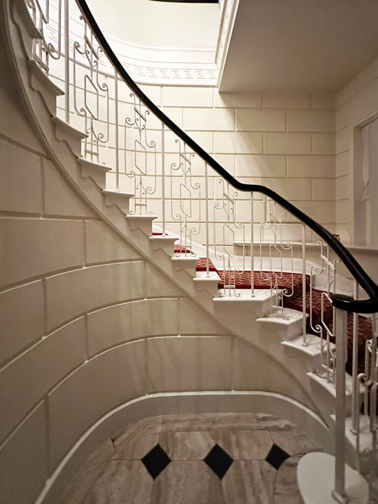
Steps Between Worlds
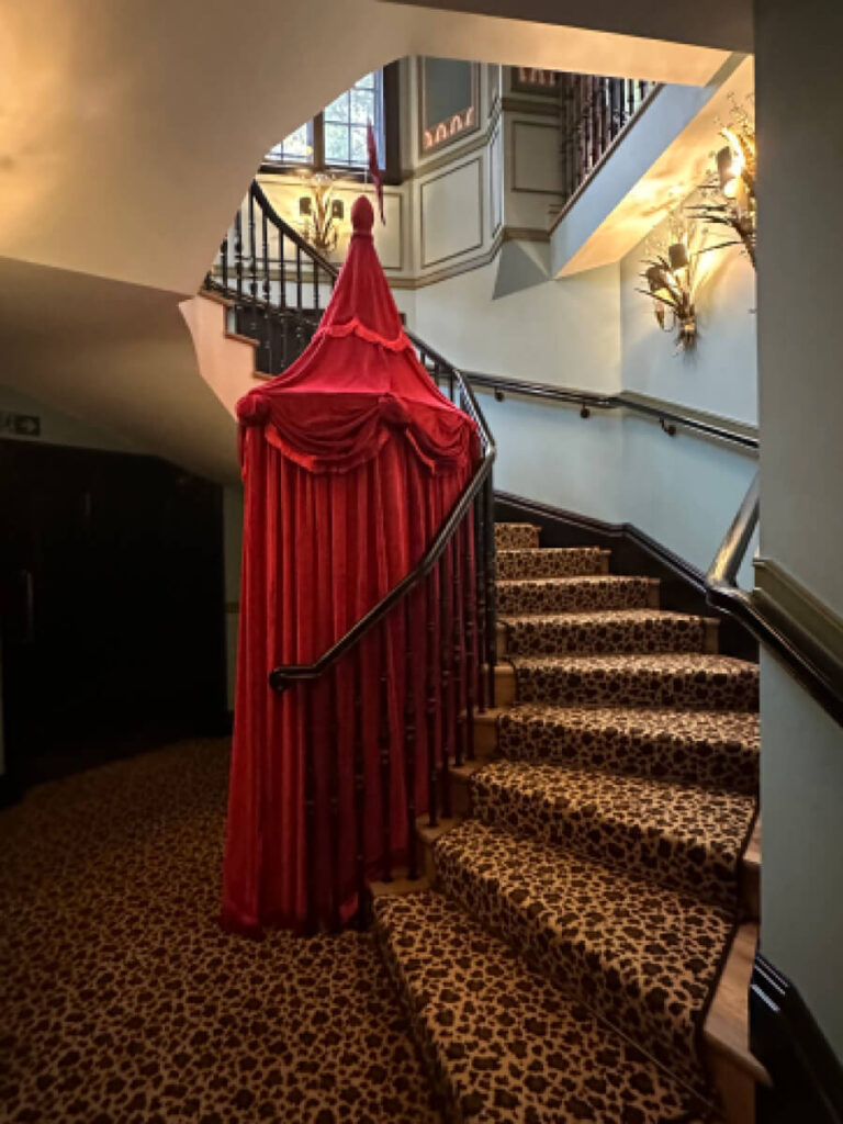
The public spaces at The Twenty Two continue the mix of tradition and personality found throughout the hotel. From the green private dining room to the guest bathrooms, every area carries its own layer of surprise. A side stair is covered in animal-print carpet and even hides a photo booth, a playful touch against the otherwise formal architecture.
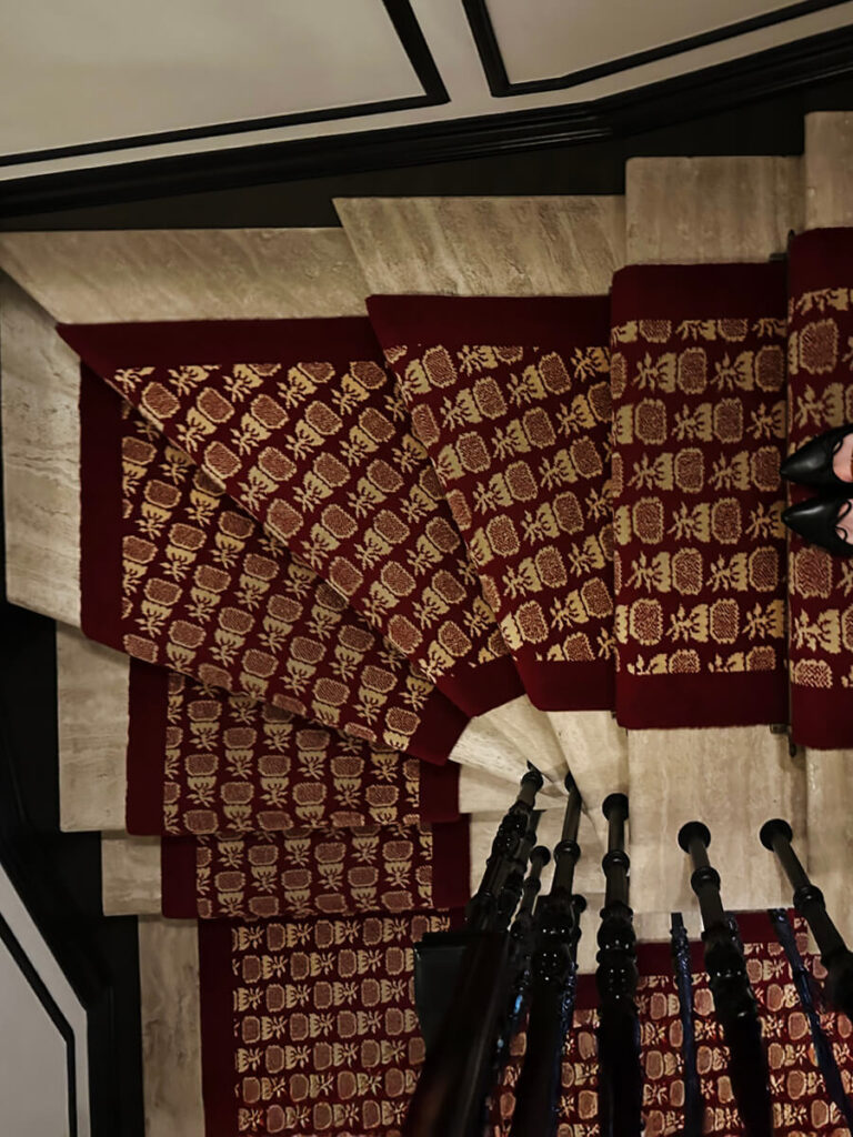
The main staircase, rising from the lobby to the top floor, is more structured: stone treads with black-and-white millwork on the walls and a burgundy-and-cream pineapple-patterned runner. The pineapple—a historic symbol of welcome—adds warmth and wit to the formal design.
From the main restaurant, another stair descends to the private club. Here, the materials shift again: polished stone steps, classic tile, and a wrought-iron railing with curved detailing. Each staircase feels distinct but related, tied together by the balance of pattern and precision that defines the entire building.
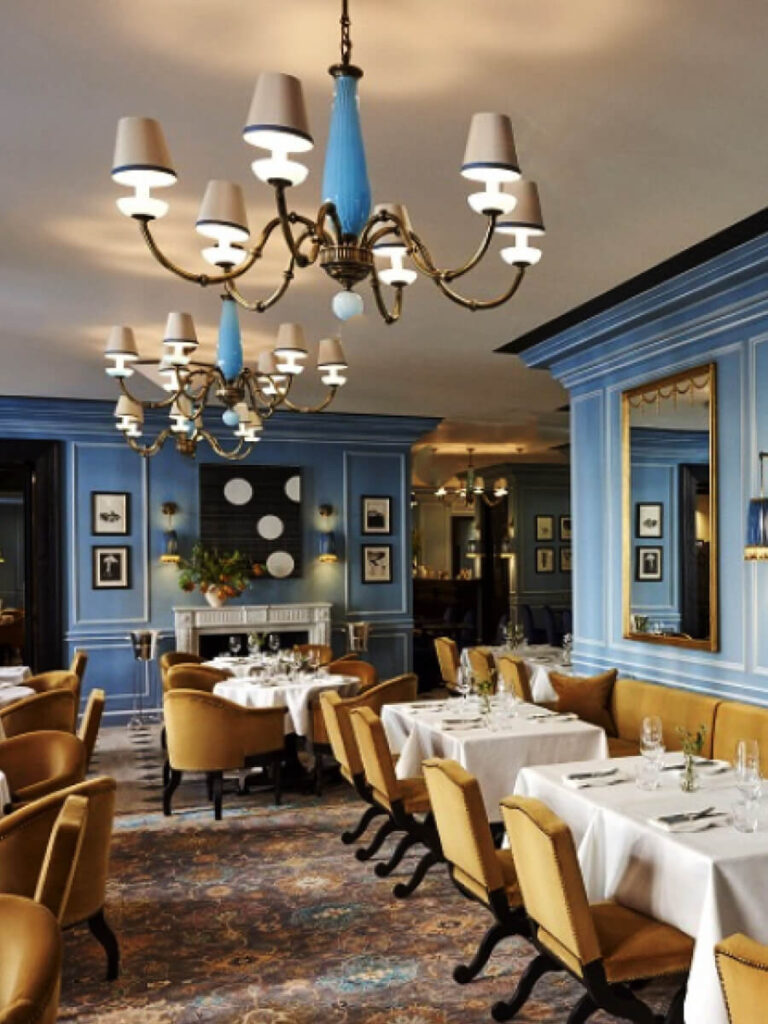
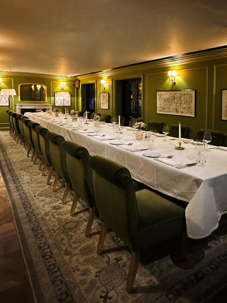
Dining, Upstairs and Down
The formal dining room, reserved only for hotel guests and private members, leans into London’s discreet exclusivity. The palette centers on robin’s-egg blue, paired with camel-colored upholstered seating that gives the space a grounded, tailored feel. Overhead, a vintage Murano glass light fixture glows in its own shade of turquoise—a softer echo of the room’s blue walls. Vintage area rugs anchor the space, adding a touch of heritage beneath the refined color story.
On the lower level, a dedicated event space continues the theme of saturated color. Here, a bold green dining table takes center stage, surrounded by monochromatic velvet chairs and another vintage rug. The combination feels intentional and layered—less about matching, more about celebrating color in all its variations.

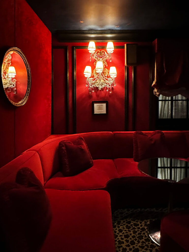
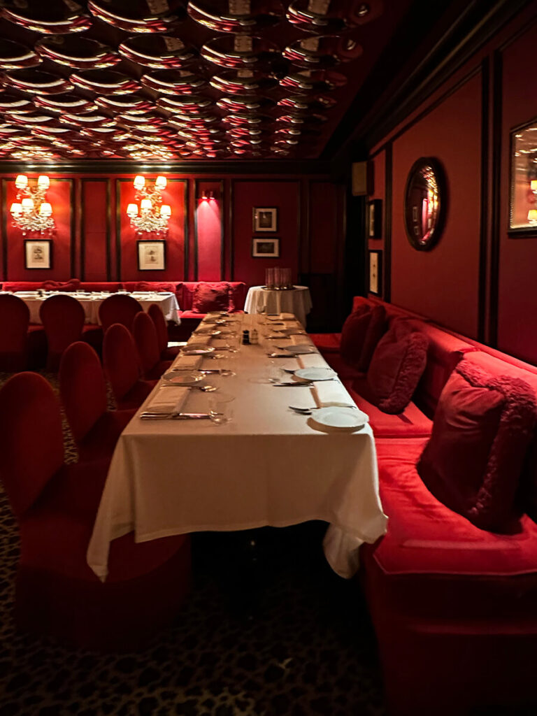
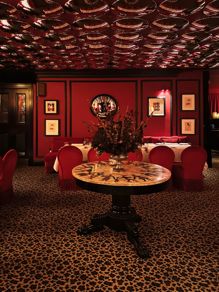
Members Only
The club feels unmistakably private—open only to hotel guests and members, in true London fashion. The palette shifts to deep red, creating a mood that’s darker and more seductive than the rest of the hotel. Animal-print carpet, bold red upholstery, and matching walls define the space, while vintage light fixtures and dark millwork keep it grounded in craftsmanship. The change in color adds energy, but the detailing ties it back to the design language seen throughout the property.
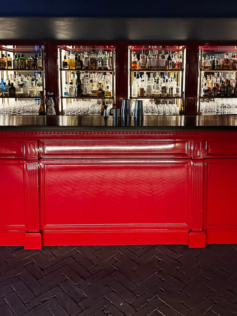
An outdoor terrace extends from the club, technically at basement level but open to the street above. It’s lined with brick pavers in a herringbone pattern, where a glossy red bar anchors the space. On one side, navy-and-white striped awnings cover bistro tables, chairs, and lounge seating. On the other, the same concept repeats in red-and-white stripe—each awning finished with a geometric apron and bronze light fixtures.
Back inside, the red continues across walls, bar panels, and even the mirrored convex ceiling, which amplifies light and motion. The atmosphere suggests late hours and limited access—a private world meant for members only.


London Boutique Hotel Interiors
The Twenty Two captures what makes London boutique hotel interiors so compelling: structure, color, and craftsmanship layered until the line between architecture and decoration disappears. Every floor tells a version of the same story—heritage adapted, not copied.
It’s a reminder that the best design doesn’t chase novelty. It builds on what’s there, reveals what’s hidden, and edits until everything feels intentional. At The Twenty Two, that balance—between classicism and modern ease—isn’t just aesthetic. It’s the London way. See more from my London trip here — dining, shopping, museums, and more. And of course, read more about our approach to design tourism and how it shapes our work.


